Forums > Game Talk > Best box art for a game
Shazbut (163) on 4/26/2006 9:52 PM · Permalink · Report
Remember in the early 90s when a work of art would adorn the box cover of the latest 16-colour side-scrolling platformer you bought? Well, I did.
So the question is: Which game has the best cover art of all time? Bonus points, (in my opinion), if the design has only the most tenuous of links with what the actual game looked like.
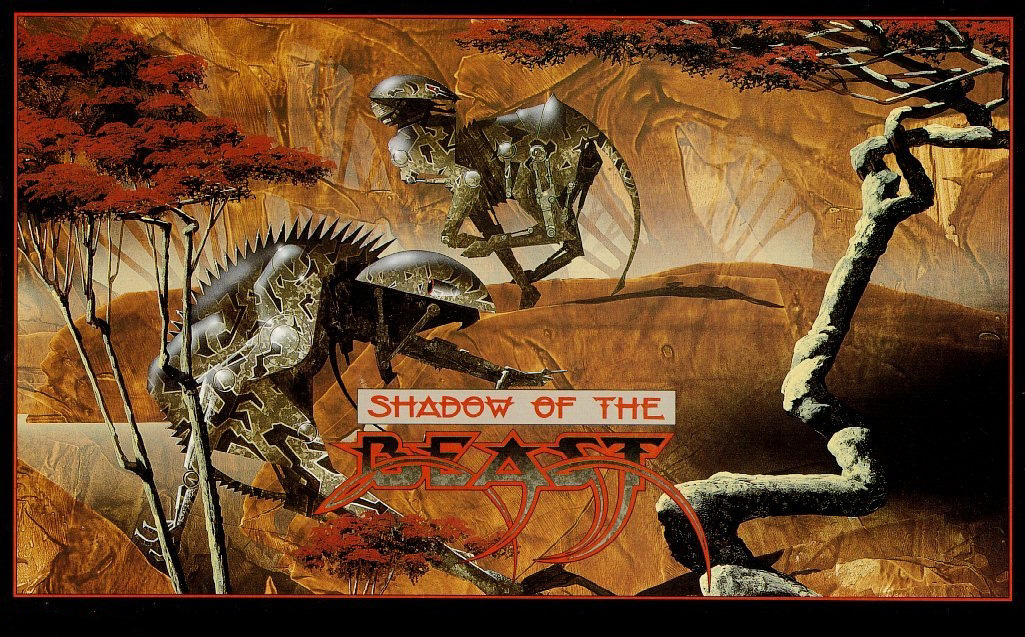
Here's my opening gambit - Shadow of the Beast. Most versions had a very stripped down image of this on the front, but check out the link below to see it in all it's glory. Man, imagine walking into a game store now and seeing a box with that on the front.
Zovni (10504) on 4/26/2006 10:42 PM · Permalink · Report
Man that box ROCKS!!! I love the cover boxes that have intrincate and beautiful illustrations like that, PC RPGs usually have among the best artwork I've seen for games (check out any D&D game, Ultima or Ishar to see what I mean (with the cover of Ishar 2 being one of the coolest I've seen). I've always wanted to see an artbook which gathered all those great illustrations... hmmm, I wonder if Taschen ever released something like that.
Shazbut (163) on 4/26/2006 11:03 PM · edited · Permalink · Report
Yeah, RPGs tend to get good treatment. Or they did. I guess artists aren't really short of stuff to paint when the games are set in huge, carefully-realised worlds.
Here are two more, both Amiga games since that's what I grew up with, although they can't compare to Beast IMO.
Gods: - Simple, bold, striking, brutal. :)
http://www.mobygames.com/game/gods/cover-art/gameCoverId,2717/
It Came From The Desert: - Satire from 1990. In a computer game, no less, and with some charming grammatical errors. Genius.
http://www.mobygames.com/game/dos/it-came-from-the-desert/cover-art/gameCoverId,830/
Zovni (10504) on 4/27/2006 1:07 AM · Permalink · Report
That's sweet, the one in Gods has to be by Bisley. He's done a lot of work for Heavy Metal magazine and he's the one that brought to prominence both Judge Dredd and Lobo with his art.
Cinemaware games had some sweet art too, I've always loved the one for Rocket Ranger... Man I want those on a book!
Shoddyan (15003) on 4/27/2006 6:14 AM · Permalink · Report
I always liked the cover art to Conflict: Freespace: The Great War (I don't like calling it Descent: Freespace). On the cover is the front of a giant spaceship. The cover opens up to show two more segments of this giant spaceship (the middle and the back) along with a tiny dot highlighted outside this ship saying "You Are Here". Barely a fraction of the size of the larger vessel.
Cute little marketing ploy. It's only when you progress far enough in the game that you discover these images are actual scale.
Ben K (23952) on 4/27/2006 7:29 AM · Permalink · Report
I think the Jap boxart for We Love Katamari gets a big thumbs up for some of the coolest box art ever:
http://www.geekonstun.com/images/we_love_boxart.jpg
The staff in front of the Namco office with various signs and objects.
And there's a giraffe on the roof.
Luis Silva (13443) on 4/27/2006 9:10 AM · edited · Permalink · Report
Roger Dean pulled or influenced of great covers in the Amiga era, such as Chrono Quest (which is my definitive pick) and Shadow of the Beast.
Some of EA Sports' early titles had sleek covers with photos of very high quality: NHL 95 and FIFA 95 (PAL) were the best they had. Surely a lot better than the usual airbrush action pics.
Other covers that I rate pretty high include Cryo's Dune and Hardwar (european), designed by TDR.
Servo (57070) on 4/27/2006 1:44 PM · Permalink · Report
Yeah, I'm a big fan of Roger Dean's artwork. Not too long ago in NYC there was an exhibition of some of Roger Dean's work that I went to see; the paintings definitely look even more amazing in person! Also rather neat, they had the original pencil sketches for the Psygnosis logo and Owl on display.
I've also always been amused by the cover for Worm Womper.
Shazbut (163) on 4/28/2006 1:11 PM · Permalink · Report
Most of the early Psygnosis covers were awesome. That logo really worked with the sci-fi/fantasy stuff and that was pretty much all they were doing back then. Check out Amnios, Ork, Agony, etc. I even had a poster of the Blood Money cover on my bedroom wall.
Oh God! I love the cover of Worm Womper! I wonder how many people who bought the game even knew that painting. Given the assumption that games are for kids, I think covers like that are hilarious.
If anyone ever writes a book on whether games are a child's pursuit masquerading as high art, that has got to be the poster image. I adore the idea that the developers were sick of computer games not being considered to be any kind of art form, and so they managed to get that to be the box art.
Zovni is right, someone has to get these pics into a coffee-table book.
Mobygamesisreanimated (11069) on 4/27/2006 4:51 PM · Permalink · Report
I can't think of a really good cover right now, but I think this is a strong contender for worst cover of all times.
Indra was here (20755) on 4/27/2006 7:20 PM · Permalink · Report
I say, that is one hell of "creative" imagination going on there on the box art. Didn't sell very either I suppose.
Servo (57070) on 4/28/2006 8:50 PM · Permalink · Report
I thought almost all of the Sega Master System boxes looked pretty bad, especially those in that particular style. (see OutRun and TransBot for some other examples of that style.)
That's one thing I both miss and am glad is gone; the "template" style box covers used on old systems. It was quite interesting that companies often followed the same design for each cover; it gave their games/system an easily recognizable and distinct look, but also sometimes limited what could be done for the cover.
Trixter (8952) on 5/4/2006 5:34 AM · Permalink · Report
[Q --start Servo wrote--] That's one thing I both miss and am glad is gone; the "template" style box covers used on old systems. It was quite interesting that companies often followed the same design for each cover; it gave their games/system an easily recognizable and distinct look, but also sometimes limited what could be done for the cover. [/Q --end Servo wrote--]
Amen, brother. I particularly like my SegaCD (for the "side strip" design) and Sega Genesis boxes (for the construction and form factor)
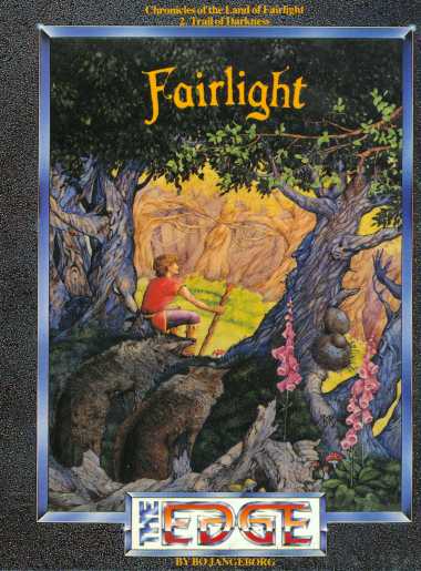
Mobygamesisreanimated (11069) on 4/27/2006 6:30 PM · Permalink · Report
How about Labyrinth and Fairlight 2?
Matt Neuteboom (976) on 4/27/2006 8:14 PM · Permalink · Report
Shadow of the Beast's cover is one of hte best covers I have ever seen. It's very nice, I like the concept, and its bold and deep.
I also like Archon's cover and Black & White's cover for the use of black and white colors.
http://www.mobygames.com/game/archon-the-light-and-the-dark/cover-art/gameCoverId,22190/