Forums > MobyGames > Site update part deux
MobyReed (325) on 2/5/2014 1:19 AM · edited · Permalink · Report
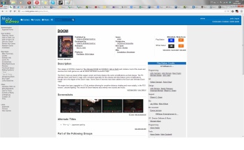
Firstly, thanks for all the feedback on yesterday's update! Simon and I read and discussed each concern. The new header seemed to go over well. However, the screenshots being placed above the description was controversial, and ultimately ended up moving them below until it is reworked.
Now onto today's update. This includes:
- Max site width for a cleaner and more organized look
- Helvetica is now the main site font
- New style for the left hand menu
- Reorganized the game browser (platform, year and genre now prioritized above Sports Theme)
- Lots of little misc. design tweaks and cleanup
I hope you guys like it. And as before, nothing is set in stone - this is an ongoing evolutionary process. :)
Please reply here with your thoughts, suggs, bugs, favorite mugs…
Thanks all!
Edit: formatting
Edit 2: Switched back to Verdana for the main font. Increased max-width. Working more on contrast/color scheme.
Indra was here (20756) on 2/5/2014 1:22 AM · Permalink · Report
Bad fixed width. Baaaad.
Adzuken (836) on 2/5/2014 1:26 AM · Permalink · Report
Well, that was jarring. I suddenly feel like I need glasses.
I really can't get behind fixed width. I now have an enormous amount of empty space at the sides of my screen. You're not going to fill that with flash ads, are you? If so, then I'm sorry, I would have to turn my ad blocker back on...
Nélio (1976) on 2/5/2014 1:38 AM · Permalink · Report
Well, here is someone for fixed width! I like it. And I'm loving the direction of the new design.
Come on guys, I bet at least half the sites you visit daily are fixed width. It just takes some time to get used to. It's not some sort of unseen revolution. Besides, from what I gather, many of you browse the site on a non-maximized browser window, so it's not that much of a difference, particularly compared to those that viewed the site at 1920px wide (as myself).
Right now what I dislike the most is the game titles. The font is too big and it should lose the underline. It really feels dated like that.
chirinea (47496) on 2/5/2014 1:39 AM · edited · Permalink · Report
I was here thinking: what if the left bar was moved all the way to the left side of the screen, leaving the fixed witdth portion in the middle, somewhat like what Facebook does with the chat app (but instead of being on the right, being on the left? I don't know, maybe that would make the site feel less empty on the sides. If someone uses a smaller resolution, the header adapts to the size of the screen, and the bar is brought closer to the middle portion (where the content is).
Something like this (sorry for my lack of artistic skills, I did that on MS Paint).
vileyn0id_8088 (21040) on 2/5/2014 2:15 AM · Permalink · Report
Hmm.
Helvetica is notoriously buggy in Firefox and I personally don't even have it installed (as such), so it falls back on Arial.
The bigger issue I see is the font size, which seems to have increased a bit - between that and the fixed max width, less info fits on the screen. Not enough info on a screen leads to scrolling. Scrolling leads to anger. Anger leads to... you know the drill. ;)
The new left side bar looks kind of... spartan? Could use a little more differentiation between section titles and individual items.
I like the game browser change!

vileyn0id_8088 (21040) on 2/5/2014 2:46 AM · edited · Permalink · Report
Yeah, you're seeing Helvetica alright.
Only certain variants of the font seem to cause the bug (which results in gibberish), and perhaps only on certain systems, but I've been bitten by it enough times to completely get rid of the pest.
For me it's also a matter of personal preference... if forced to choose a neo-grotesque sans-serif typeface, I'd say screw both Arial and Helveticaca - Univers ftw. :)
Cavalary (11445) on 2/5/2014 2:20 AM · Permalink · Report
Yeah, just what I was saying. The fixed (or max, whatever, same thing unless on very small resolutions, if even I notice it at 1280x1024) width thing was the first thing it all started from when a certain other redesign hit. New thin font is harder to read too, but doesn't even matter anymore.
Hardly unexpected.
leilei (343) on 2/5/2014 3:11 AM · edited · Permalink · Report
I also see Arial. Helveltica is only standard on Macs. Right now the board is looking like an early UBB, so ironically this site update looks even more regressive...
ALSO WHERE IS MOBYDARK? I do not like bright web sites, this isn't paper. jeez, what happened to not fixing what's not broken? Evolution is fine but this is all too drastic for me to take in all at once. It's slowly creeping to looking like the horrid Gamefly rendition...
Foxhack (32100) on 2/5/2014 4:54 AM · Permalink · Report
The first thing I thought of when seeing this new layout?
http://www.youtube.com/watch?v=xoMgnJDXd3k
I'M ALSO BLIND NOW, WHY IS EVERYTHING SO DAMN WHITE
Game Guesser (28) on 2/5/2014 5:15 AM · Permalink · Report
I'm super lazy, could someone please point me to the full argument on what needed to be changed about Mobygames' visual design and why? Because I genuinely don't understand the reason these changes were made, but I'm open to persuasion if someone can tell me where the debate is best laid out. There are a lot of things about website design that I never notice.
Nélio (1976) on 2/5/2014 5:32 AM · Permalink · Report
The site looked the same for over a decade. It needed the facelift, badly.
Everyone should keep in mind that this is a work in progress, and that the new management is taking everyone's input into consideration. It's just impossible to make everyone happy.
Indra was here (20756) on 2/5/2014 10:42 AM · Permalink · Report
[Q --start Nélio wrote--]It's just impossible to make everyone happy. [/Q --end Nélio wrote--]They were quite happy before, mind you.
András Gregorik (59) on 2/5/2014 10:47 AM · Permalink · Report
[Q --start Nélio wrote--]The site looked the same for over a decade. It needed the facelift, badly... It's just impossible to make everyone happy. [/Q --end Nélio wrote--]
You're basically repeating GameFly's corporate arguments. Let's not start another landslide...
The core community was perfectly happy with the unfixed width and the old main page (new reviews on the top).
Nélio (1976) on 2/5/2014 3:51 PM · Permalink · Report
[Q --start András Gregorik wrote--] [Q2 --start Nélio wrote--]The site looked the same for over a decade. It needed the facelift, badly... It's just impossible to make everyone happy. [/Q2 --end Nélio wrote--]
You're basically repeating GameFly's corporate arguments. Let's not start another landslide...
The core community was perfectly happy with the unfixed width and the old main page (new reviews on the top). [/Q --end András Gregorik wrote--] Seriously, comparing what the new management is doing and looking to achieve with that GameFly debacle is unreasonable.
How many people is the core community? The admins want (and need) MobyGames to become much larger than that. We can't just stay the same because everyone was used to how things were. The fact is that this site should have a huge user base, and it doesn't. It's not that great of a leap to consider that the design has some impact on that. I, for one, thought the design looked outdated for some years.
Most of what is being discussed here is really a matter of taste and rather subjective. I like fixed-width or whatever you want to call it. Most of the sites I use on a daily basis look like this, so I don't get all this backlash. I have 23 tabs open right now, 18 of which are fixed-width. And I'm including here some of the top gaming sites out there.
AND the admins ASKED for feedback. Nothing is set to stone. Give your feedback, but don't be such doomsayers.
Fred VT (25953) on 2/5/2014 4:00 PM · edited · Permalink · Report
[Q --start Nélio wrote--]Most of the sites I use on a daily basis look like this, so I don't get all this backlash. I have 23 tabs open right now, 18 of which are fixed-width. And I'm including here some of the top gaming sites out there. [/Q --end Nélio wrote--]
It's not because everyone does it that it's a good idea...
Anyway, the issues I have with the current look is not the fixed-width itself, but has more to do with the grey border it adds. The top corners are rounded while the bottom ones are squared. There are two tones of grey that overlap, which might look better with some kind of border in between.
I think it's simply unnecessary as it doesn't improve anything over part 1, which did add something.
Btw, I hope this is taken as constructive ;)
Adzuken (836) on 2/5/2014 4:15 PM · edited · Permalink · Report
[Q --start Nélio wrote--] Most of what is being discussed here is really a matter of taste and rather subjective. I like fixed-width or whatever you want to call it. Most of the sites I use on a daily basis look like this, so I don't get all this backlash. I have 23 tabs open right now, 18 of which are fixed-width. And I'm including here some of the top gaming sites out there. [/Q --end Nélio wrote--] Fixed width works for blogs and news sites where information is best provided in a chronological fashion, but Mobygames is a resource site. When I look up a game, I want to see all the information on it with as little scrolling and as few clicks as possible. Fixed width wastes a lot of space.
And the excuse that "Everyone else uses it; so should we," doesn't fly. Wikipedia doesn't use it. Most of Google's sites don't use it. Fixed width isn't key to popularity.
Nélio (1976) on 2/5/2014 4:20 PM · Permalink · Report
[Q --start Adzuken wrote--] And the excuse that "Everyone else uses it; so should we," doesn't fly. Wikipedia doesn't use it. Most of Google's sites don't use it. Fixed width isn't key to popularity. [/Q --end Adzuken wrote--] I didn't say we should do it because others are doing it, but rather that this isn't something unseen or even rare for that matter. It's one of the most popular standards.
And in the other thread so many were saying they don't visit the website on fullscreen. They view it on a smaller window, hence having a similar effect as the fixed-width.
Adzuken (836) on 2/5/2014 4:35 PM · Permalink · Report
[Q --start Nélio wrote--] I didn't say we should do it because others are doing it, but rather that this isn't something unseen or even rare for that matter. It's one of the most popular standards.
And in the other thread so many were saying they don't visit the website on fullscreen. They view it on a smaller window, hence having a similar effect as the fixed-width. [/Q --end Nélio wrote--] And what I'm saying is popularity doesn't equate quality.
Just because some people choose to view the site in a narrow window, doesn't mean that everyone should be forced to. The fixed width isn't the end of the world, but that doesn't make it a positive step forward.
Nélio (1976) on 2/5/2014 4:41 PM · Permalink · Report
[Q --start Adzuken wrote--] The fixed width isn't the end of the world, but that doesn't make it a positive step forward. [/Q --end Adzuken wrote--] I just don't know why it's a definite step backwards.
I really don't care that much. What I'm looking for in MobyGames is content and functionality. Otherwise, I'd have stopped using YouTube when they redesigned.
MobyReed (325) on 2/5/2014 5:13 PM · edited · Permalink · Report
[Q --start Adzuken wrote--] Fixed width works for blogs and news sites where information is best provided in a chronological fashion, but Mobygames is a resource site. When I look up a game, I want to see all the information on it with as little scrolling and as few clicks as possible. Fixed width wastes a lot of space.
And the excuse that "Everyone else uses it; so should we," doesn't fly. Wikipedia doesn't use it. Most of Google's sites don't use it. Fixed width isn't key to popularity. [/Q --end Adzuken wrote--] Actually, most of the big resource sites are max or fixed-width I think. IMDB, Metacritic, RottenTomatoes, GameFaqs, Wikia, Google Search...
Wikipedia is a notable exception though.
Mikael Palsio on 2/5/2014 5:30 PM · Permalink · Report
IMDB, Metacritic, RottenTomatoes, GameFaqs, Wikia, Google Search...
IMDB got a lot of flack for their redesign that actually made the site unusable to people who used it professionally to check people's credentials (for example printing became a hassle), but they were too big and too rare to actually fall down. So are the rest of the pages you mentioned. Like the last redesign proved, Mobygames is not.
At the moment IMDB is a mess, with false info all around that nobody can fix since that was outsourced and the people who run the IMDB could not give a damn. Not to mention their "genius" choice of removing the left side bar, putting it to the bottom because "that's where people went first according to our surveys (thoughg we didn't check if they were just happy with the left side bar and went to the bottom of the page to check the presented first review)". Then they put in a god awful pop-up menu and now they've replaced it with an awful button that opens up a new menu. Whatever happened to KISS-style design?
What you are doing here is "the only reason we should do it is because everybody is doing it", which is excactly the vibe that came out from the Gamefly redesign.
MobyReed (325) on 2/5/2014 6:00 PM · Permalink · Report
But let's be fair, every redesign in the history of the web has gotten flack. IMDB is a top 50 site in the world, so no doubt they got a lot. :)
Fixed or max-width sites are more usable for reading paragraphs. That's why newspapers, magazines and most sites where you read articles are formatted the way they are. Once you get to a certain width, paragraphs become harder to read because the next line is far away from where your eye previously was. MobyGames is now more readable/usable (outside of the contrast perhaps, which is being worked on still) and that's why it was done.
eXo (346) on 2/5/2014 6:10 PM · edited · Permalink · Report
IMDB is falling fast. I have moved to TMDB and spent so much time adding content they modded me. So now I see the site statistics, and traffic is growing exponentially. Even media software like XBMC has moved away from using IMDB as a resource, and instead uses better organized sites like TMDB.
When the gamefly thing happened, people already started looking for alternatives to mobygames, and as the previous poster pointed out - moby doesn't have the same primary association with the genre that IMDB carries. Hell, it is still recovering from it's deathbed.
Traffic on the site went down because of the horrible redesign. Every day there seems to be a new post in the forums, "Hey, the old site is sort of back... yay!"
And for every post, there are lots more people who discover that too.
Want to see traffic light up? Advertise on boards that the site is back.
If you and simon seriously think screweing with the site width and moving screenshots around is some sort of magic traffic pill... then holy hell... this is just the beginning of a very long ride to chase down visitors.
You guys already have more than a few fellows feeling as though the gamefly redesign is back in full swing, just at a slower pace. If that stigma starts to become more accepted, then all this work is for nothing. No matter how well intentioned.
MobyReed (325) on 2/5/2014 6:20 PM · edited · Permalink · Report
Of course, bringing Moby into modern day is part of the strategy to ensure its survival. For starters, it's a clear signal that the place is still alive and being supported. Plus there are a lot of changes that can make it more usable (max-width is one of those).
The site has been losing traffic for years and a big reason for that is because it wasn't being updated. I know many people in the games industry and it's not uncommon for them to think that Moby was long ago abandoned. Part of that is design, part of that is content (missing new games, etc).
We've also added missing platforms (see: Arcade, Ouya, Kindle), been pushing to clear out an enormous backlog, fixed some bugs, etc. So it's certainly not just about a new coat of paint.
Mikael Palsio on 2/5/2014 6:41 PM · Permalink · Report
What? Do you understand how stupid this comes of as?
If you want people to know that Mobygames is still alive, you guys need to advertise. Try to contact gaming webpages to put yourself on the map as the best site for game information.
If you want to redo the Gamefly catastrophe, then go ahead.
eXo (346) on 2/5/2014 8:54 PM · Permalink · Report
But the reason the site wasn't getting updated had to do with the submission system and the backup. I have built a database of DOS games over the past 5 years. A little over a year ago I came to mobygames and said, 'Look, I have a database here that is filled out with game name, year of release, publisher developer, genre, etc... and I have identified over 1,500 titles that are not cataloged here. Can we find a way to load these on the backend?"
I was told very quickly, "Nope, enter them by hand."
Followed up with, "Just imagine how many submission points you'll earn!"
Frankly, I don't give a damn about imaginary points. Nor am I all that interested in spending hours and hours of my time building up a privately owned database that I can't even export data from if I need it.
But, in the interest of community, I tried entering a few new games while attempting to fix errors as I came across them.
Submissions could take weeks or even months to hear back on. I had one that I got back 7 months after I submitted it.
Now my database has well over 2,500 DOS games that are unlisted here, and about 400 win 3.x titles that are unlisted here.
And there isn't much in the way of motivation to enter any of it.
If there is a lack of updates, then that is the issue right there. The fact i can't upload all this without doing it by hand, and then the fact I can't re-export any of my work (or anyone else's).... makes it easier to just scrape moby games and maintain my own database.
Sciere (930479) on 2/5/2014 9:04 PM · edited · Permalink · Report
There's this open document that can be used as an open reference to list missing titles and encourage collaborative work. Loading titles in the backend without a description, release info, screenshots, credits or any kind of information and bypassing the approval / verification process would be equally useful as not listing them at all. Otherwise we could equally scrape Steam, Sony's SOE PSN store, Xbox.com and just sit back and watch this site magically build itself and not be useful to any human being. Since joining the site, you've added 1 game every 1,5 years, so that may take some time then.
An API and looser license for data usage have been hinted at, but I expect Reed will need at least the whole of 2014 to get this 1999 Perl/HTML 3.0 beast under control.
Indra was here (20756) on 2/5/2014 9:10 PM · Permalink · Report
Scrape Steam. Hah! cries
If I ever meet the dude who is charge of release info on Steam...prepares digital rock
Foxhack (32100) on 2/5/2014 11:43 PM · Permalink · Report
[Q --start Indra was here wrote--]Scrape Steam. Hah! cries
If I ever meet the dude who is charge of release info on Steam...prepares digital rock [/Q --end Indra was here wrote--]There's a game up there called Agarest Generations of War. It was released last year, but they changed the release date to February 4, because fuck being accurate.
Indra was here (20756) on 2/5/2014 11:52 PM · Permalink · Report
[Q --start Foxhack wrote--] [Q2 --start Indra was here wrote--]Scrape Steam. Hah! cries
If I ever meet the dude who is charge of release info on Steam...prepares digital rock [/Q2 --end Indra was here wrote--]There's a game up there called Agarest Generations of War. It was released last year, but they changed the release date to February 4, because fuck being accurate. [/Q --end Foxhack wrote--] Yeah, for older games, you won't find an actual Steam release. All the release info for those games at Steam have been changed to the release date of the original release. So technically, we're actually more accurate than Steam when it comes to Steam release dates.
Yeah, because Mexicans. Hey, you said I could insult you. :p
Foxhack (32100) on 2/6/2014 12:05 AM · edited · Permalink · Report
[Q --start Indra was here wrote--] [Q2 --start Foxhack wrote--] [Q3 --start Indra was here wrote--]Scrape Steam. Hah! cries
If I ever meet the dude who is charge of release info on Steam...prepares digital rock [/Q3 --end Indra was here wrote--]There's a game up there called Agarest Generations of War. It was released last year, but they changed the release date to February 4, because fuck being accurate. [/Q2 --end Foxhack wrote--] Yeah, for older games, you won't find an actual Steam release. All the release info for those games at Steam have been changed to the release date of the original release. So technically, we're actually more accurate than Steam when it comes to Steam release dates.
Yeah, because Mexicans. Hey, you said I could insult you. :p [/Q --end Indra was here wrote--]They released the PC port of the game on Steam on October 3rd, 2013. The date on the store page was accurate and remained the same until yesterday, when the game had its release date altered to February 4 FOR NO GODDAMN REASON.
All the DLC that was released for the game on launch still has an October 3rd release date. Even the search results - which usually have the actual release date listed- show the game's release date as February 4th. This is a gigantic fuckup, but of course, it's Steam, who cares about accuracy in their office? Nobody.
All this for a mediocre anime game with boobies.
Indra was here (20756) on 2/6/2014 12:19 AM · Permalink · Report
Why exactly are they changing all their release dates when it was right the first time around? I see no logic in this.
Foxhack (32100) on 2/6/2014 12:24 AM · Permalink · Report
[Q --start Indra was here wrote--]Why exactly are they changing all their release dates when it was right the first time around? I see no logic in this. [/Q --end Indra was here wrote--]That's what I'm trying to say. It doesn't have any logic to it.
As far as I can tell this has only happened when a game gets a substantial update (free DLC updates to the base game), or a name change. But the game's still the same.
Indra was here (20756) on 2/6/2014 2:28 AM · Permalink · Report
[Q --start GTramp wrote--]Usually there are some news items on steam that announce the game's release. Those can be accessed from game's page, or by google search. I imagine though that there are games released without any news at all. [/Q --end GTramp wrote--]Yeah, but not entirely reliable either. Have to check with game developer's website (indie games usually) and compare the release info there with the news and the official Steam release info to see if the dates match.
Though for the most part, they mention a new update in the news, but don't mention what freakin' release version of the game they just released. And yes, many don't even bother to update the news at all.
Foxhack (32100) on 2/6/2014 10:30 PM · edited · Permalink · Report
[Q --start GTramp wrote--]Usually there are some news items on steam that announce the game's release. Those can be accessed from game's page, or by google search. I imagine though that there are games released without any news at all. [/Q --end GTramp wrote--]Nope. Not always. Sometimes a game gets its appid changed, and so the actual news item can't be found via the game's update feed. Or the news item doesn't have the game associated with it.
And let's not forget the fact that they lost like two or three months worth of news updates due to a server crash - and never fixed them.
Nowadays game devs are encouraged to use the game community announcements to publish updates rather than the news feed. Because hey who needs standards, right?
Indra was here (20756) on 2/7/2014 3:00 AM · Permalink · Report
[Q --start Foxhack wrote--] And let's not forget the fact that they lost like two or three months worth of news updates due to a server crash - and never fixed them. [/Q --end Foxhack wrote--]Is that reason perhaps? Some stupid bug made 'em lose all their release info?
Foxhack (32100) on 2/7/2014 6:58 AM · Permalink · Report
[Q --start Indra was here wrote--] [Q2 --start Foxhack wrote--] And let's not forget the fact that they lost like two or three months worth of news updates due to a server crash - and never fixed them. [/Q2 --end Foxhack wrote--]Is that reason perhaps? Some stupid bug made 'em lose all their release info? [/Q --end Indra was here wrote--]They were doing that before the Steam Community "upgrade", so no.
They're just incompetent and lazy.
Игги Друге (46653) on 2/5/2014 10:14 PM · Permalink · Report
[Q --start Sciere wrote--]There's this open document that can be used as an open reference to list missing titles and encourage collaborative work. Loading titles in the backend without a description, release info, screenshots, credits or any kind of information and bypassing the approval / verification process would be equally useful as not listing them at all. [/Q --end Sciere wrote--]
Only if you have no imagination.
Havoc Crow (29831) on 2/6/2014 8:29 AM · Permalink · Report
[Q --start Sciere wrote--]There's this open document that can be used as an open reference to list missing titles and encourage collaborative work.[/Q --end Sciere wrote--] Incidentally, that document needs some cleanup (for instance, there's plenty of crossed-out titles, for games that have already been added to the database -- I don't think there's much point in keeping these months after the fact.)
eXo (346) on 2/7/2014 2:07 AM · Permalink · Report
As I satetd very clearly at the time, my database DOES have release info, descriptions, and each game has at the very least a title shot and screen shot. Not that those last two are mandatory. you have tons of dos games with no art (cover or screens).
Rola (8483) on 2/6/2014 12:09 AM · edited · Permalink · Report
@eXo: Do you realize that importing such amount of data would require coding a special script? It's not like switching to a new forum software. Import would require manual supervision to resolve issues "do you mean Atari Inc. till 1984 or Atari Inc. from 2003?"
You have description for every game, right?
Does your release info follow our structure? Year/publisher/developer is tied to country-of-release.
eXo (346) on 2/7/2014 2:13 AM · Permalink · Report
yes, description for everygame. release year for every game. country of origin for every game. my database has more fields than moby does, and is much more complete (for DOS games only here). Of the titles,I do have that are also on MG, I have found credit info, version release info, and all sorts of other details that are generally missing here.
So yea, as a data manager - a script makes a hell of a lot more sense to me than doing it all by hand.
chirinea (47496) on 2/6/2014 3:50 AM · Permalink · Report
[Q --start Nélio wrote--] [Q2 --start eXo wrote--]Submissions could take weeks or even months to hear back on. I had one that I got back 7 months after I submitted it. [/Q2 --end eXo wrote--] My record was waiting more than 2 years for an approval. :-) [/Q --end Nélio wrote--]If you guys wanna play this game, I have a correction pending since 2007.
Nélio (1976) on 2/6/2014 4:15 AM · Permalink · Report
[Q --start chirinea wrote--] [Q2 --start Nélio wrote--] [Q3 --start eXo wrote--]Submissions could take weeks or even months to hear back on. I had one that I got back 7 months after I submitted it. [/Q3 --end eXo wrote--] My record was waiting more than 2 years for an approval. :-) [/Q2 --end Nélio wrote--]If you guys wanna play this game, I have a correction pending since 2007. [/Q --end chirinea wrote--] :o Must be some correction...
Mikael Palsio on 2/5/2014 6:13 PM · Permalink · Report
And like I said, IMDB is too big to fall and has no big alternatives, unlike Mobygames. They are like Sony, they can sell their product for whatever low price they want, since they have the money to loose profit. And the response from the IMDB people toward the criticism (even the friendly kind) was absolutely insulting ("we tested 50 users and they said everyone of you would like this better"). They failed, and instead of trying to make amends, they've just made it worst, but they have the base to stay standing.
And no, having a fixed width doesn't make a webpage any more readable. At the moment when I'm watching the front or a game page, only thing that comes to my mind is "amateurish." You might find it readable/usable, but personally I don't find it usable with everything looking like too much info being squished to a space that isn't enough for it.
Игги Друге (46653) on 2/5/2014 7:51 PM · Permalink · Report
I have yet to be stricken by the fixed width since at least it's smaller than my windows, so in fact I haven't noticed it at all.
However, if some people like to use the site maximised, and you being right in that the description shouldn't be too wide for sake of legibility, can't modern HTML be used to stuff in more screenshots to the right of the description if the window size allows?
MobyReed (325) on 2/5/2014 8:17 PM · Permalink · Report
[Q --start Игги Друге wrote--]However, if some people like to use the site maximised, and you being right in that the description shouldn't be too wide for sake of legibility, can't modern HTML be used to stuff in more screenshots to the right of the description if the window size allows? [/Q --end Игги Друге wrote--] In modern design it can, but Moby is full of old school tables and such.
Ultimately I want to replace it all so it's fully responsive (so it scales nicely all the way from large displays -> phone), but that's a ways down the road I think.
is_that_rain_or_tears (634) on 2/6/2014 4:46 PM · edited · Permalink · Report
[Q --start Dais wrote--]I'm super lazy, could someone please point me to the full argument on what needed to be changed about Mobygames' visual design and why? Because I genuinely don't understand the reason these changes were made, but I'm open to persuasion if someone can tell me where the debate is best laid out. There are a lot of things about website design that I never notice. [/Q --end Dais wrote--]
Vulgarisation and mediocrity is the best way to attract new audience, which translates into more money. Money, we know, is the prime (when not the sole) aim of the majority of persons. It can't, then, be any surprise if it is the prime (or sole authentical) aim of this site. Super short explanation for the super-lazy :).
If it agrees with reason to contribute for free to a site which has this goal, may be an ethical dilemma.
Nélio (1976) on 2/6/2014 5:09 PM · Permalink · Report
[Q --start ^~…±‰≈≠¤ wrote--] [Q2 --start Dais wrote--]I'm super lazy, could someone please point me to the full argument on what needed to be changed about Mobygames' visual design and why? Because I genuinely don't understand the reason these changes were made, but I'm open to persuasion if someone can tell me where the debate is best laid out. There are a lot of things about website design that I never notice. [/Q2 --end Dais wrote--]
Vulgarisation and mediocrity is the best way to attract new audience, which translates into more money. Money, we know, is the prime (when not the sole) aim of the majority of persons. It can't, then, be any surprise if it is the prime (or sole authentical) aim of this site. Super short explanation for the super-lazy :).
If it agrees with reason to contribute for free to a site which has this goal, may be an ethical dilemma. [/Q --end ^~…±‰≈≠¤ wrote--] That's a bit offensive to the new admins and to everyone who hasn't gone berserk with these changes. But hey, whatever.
CalaisianMindthief (8172) on 2/5/2014 5:48 AM · edited · Permalink · Report
The fixed width looks pretty ok. The screens are tidier now as well. What bothers me: too much gray (1) and some pages like the game browser don't use the entire space to the right (2). Some title bars like the one for the credits are too square, it needs to follow the header's form in my opinion.
GAMEBOY COLOR! (1990) on 2/5/2014 5:54 AM · edited · Permalink · Report
I think fixed width is fine, but it needs to be a bit wider. Everybody has such large screens now it doesn't make a lot of sense for it to be narrow. Other than that, it's looking pretty good so far!
Edit-Also, what happened to the articles ?
Indra was here (20756) on 2/5/2014 10:44 AM · Permalink · Report
[Q --start DANIEL HAWKS ! wrote--]Edit-Also, what happened to the articles ? [/Q --end DANIEL HAWKS ! wrote--]It was only your article there for what seems like a decade. Surely, that's enough ego publicity, mate. :p
Havoc Crow (29831) on 2/5/2014 5:50 AM · edited · Permalink · Report
[Q --start Reedx wrote--]
- Helvetica is now the main site font
[/Q --end Reedx wrote--]
Oh no, no, no... Sorry, but I hate the font, and I liked the font that was in place. Arial/Helvetica looks just so dull and plain.
formercontrib (157510) on 2/5/2014 6:41 AM · Permalink · Report
Fixed width is fine for me, too. The grey in black isn't my thing, it's not nearly that good to read as it was before, hard for the eyes of an ol' man, maybe with the time i'm getting used to, but actually i don't like it. Missing other schemes like MobyDark isn't a problem to me, as i never used those. Size and look - in light blue - of the title are fine for me too, now.
Игги Друге (46653) on 2/5/2014 7:59 PM · Permalink · Report
Helvetica is great for signs, but not for texts of any length. Verdana is optimised for computer screens, Helvetica isn't.
Pseudo_Intellectual (66360) on 2/5/2014 6:53 AM · edited · Permalink · Report
1st response: ooh, something has changed, and I have a headache!
2nd impulse: everything is so bright! (turns screen brightness down to second-lowest level)
3rd observation: and they changed the font! Display size is 100% but it looks like individual words are... smaller! (and here on my Chrome some weird kerning was a dead giveaway.) I don't know if what I'm seeing is Helvetica or Arial (I suspect the latter) but the overall effect is one of ... accidentally carrying out my business while in the wrong screen resolution.
final observation: since we're having such extensive discussion about how to make the best use of screen real estate, why throw away a quarter of it on blank perma-sidebars?
András Gregorik (59) on 2/5/2014 9:01 AM · Permalink · Report
I think the blue banner was a good thing, but today's update is a step in the GameFly direction... Fixed width is wrong.
Havoc Crow (29831) on 2/5/2014 11:57 AM · Permalink · Report
The news item titles look weird. The background isn't dark enough to look different from white.
vileyn0id_8088 (21040) on 2/5/2014 12:30 PM · Permalink · Report
After sleeping on it and looking at it with fresh eyes... yeah, sorry but this is not a step in the right direction.
Web design is part of what I do for a living, and I have enough background and experience to be confident in what I'm saying here, but I'm saying these things primarily as a user.
-
Font issue: people love Helvetica and all, I get that. As has been pointed out though, it's only preinstalled on relatively few computers, and certain variants of it are known to be buggy in browsers.
The old design used Verdana; perfectly pleasant and readable for body copy, but I actually never liked the way it looks in large point sizes, so for titles, I do applaud the decision to replace it. With Helvetica it's the other way around - it works very well for large text, but the way it's rendered in smaller point sizes causes an overly thin, bunched-together look that impacts readability.
I'd choose a Helvetica-like font for titles - in CSS3 @font-face format, to ensure compatibility(!) - and keep something like Verdana or similar for body copy. Using the old size/line spacing, too. -
Max width (which thankfully isn't truly "fixed"): I don't use a wide screen on my desktop, so it doesn't impact me that much, and I do recognize the need for a width limit to keep certain parts of the layout organized (e.g., readable paragraph widths). OTOH, screen real-estate shouldn't be wasted, and on most of today's wider displays that's exactly what's happening. This would be relatively easy to fix though: increase the max width at least half way towards 1920px, which seems to be the de-facto standard these days.
This bears repeating: squeezing things into a narrow layout while enlarging the fonts increases the need for scrolling, which is bad news for usability. That was one of the biggest complaints with the GameFly hackjob, and for good reason - fortunately, it's easily salvageable with the current layout; "happy medium" should work here. - Color scheme: the increased contrast is hard on the eyes; you could easily find a dozen articles by design experts to tell you that's a no-no. The sprinklings of light grey are still too close to white, and don't differentiate well. Modernizing the site is a worthy prospect, but while certain things about the old layout did look "dated", the color scheme (by itself) wasn't one of them. This is just one of those things I fail to see a valid reason for.
- Content/functionality removal: this is potentially the touchiest part of it all. True, everything is largely still intact and for that we are thankful. But when things like Featured Articles and MobyDark start getting the axe, it isn't encouraging. Esepcially when maintaining them both would be a relatively simple and painless thing to do.
I don't think it's all bad, though - I like the new header, the rounded corner look, the rearranged game browser, the larger game/platform titles, etc. However, there are certain design trends and pitfalls which are best avoided, and it really isn't hard to keep the site modern and up-to-date without them.
Reed, Simon: don't get me wrong - I love what you've done for MG since the acquisition, and would certainly love to see you keep it up! This, though, is the first update which I don't feel positive about overall, in terms of usability and design - despite the good points which I can certainly recognize and appreciate. It's good to see incremental updates being shared with the community for evaluation, and knowing that nothing's set in stone. But, especially after the Nameless Horror that buried this site alive for three whole months last year, I feel it is important to point out any potentially bad developments.
tl;dr, yes. Had to be said though.
Patrick Bregger (299646) on 2/5/2014 4:22 PM · Permalink · Report
This post pretty much sums up what I think about the "part two". I could live with the fixed width - even if I don't like it and don't see any advantage to it - but the new contrast is just bad.
Simon Carless (1835) on 2/5/2014 4:56 PM · Permalink · Report
Let me list a few things that people are commenting on for my 2c. And FWIW, we are not going to do anything that the community vehemently does not believe in - you've seen us roll back things already.
-
For me, I do think the site has gone a bit too contrast-y with the last update. I had to turn down my brightness as well. So that's definitely something to take a look at.
-
Fixed width, I'm not sure I have a strong opinion on either way. Obviously it depends on browser size. If you want design to be remotely neat in the long-term, fixed width is probably important, though. Maybe a slightly wider fixed-width could make sense?
-
Fonts? Hm... I'm not sure right now. I'm wondering if the Helvetica denseness is contributing to the contrast-y issue a bit.
-
I like a lot of the other changes - I haven't been working step by step on them, but I've been kept aware of them and overall I think the site is starting to look more up to date and the layout of the game pages is much more modern.
-
Re: axing things, I believe Reed has unlinked Featured Articles, yes, but as you all know, that was not remotely an often-used feature, and you have my word that we won't be changing any key functionality. Again, this is a labor of love for us as much as for you guys so we all want to be on the same page.
I don't think it's as binary as 'roll back vs. stay the same', Indra - but let's talk through these changes and work em out together.
MobyReed (325) on 2/5/2014 5:06 PM · Permalink · Report
Thanks for the constructive feedback.
Will change body text to Verdana. It's not a big deal to me either way, I also dig Verdana and use it a lot, so, might as well use what you guys are used to.
Continuing work on contrast / color scheme.
You're right, it's max-width, not fixed width. It collapses to a certain point. And I think the max can increase a bit.
Articles weren't being used (only 1 in the past 4 years), so I'm surprised anyone even noticed. They still exist, but are no longer featured on the homepage. With them not being used for years it was pretty silly for it to have a section on the homepage.
Kabushi (261192) on 2/5/2014 5:15 PM · Permalink · Report
[Q --start Reedx wrote--] Articles weren't being used (only 1 in the past 4 years), so I'm surprised anyone even noticed. They still exist, but are no longer featured on the homepage. With them not being used for years it was pretty silly for it to have a section on the homepage. [/Q --end Reedx wrote--]I agree, but it wouldn't hurt to have a link to it in the menu to the left.
vileyn0id_8088 (21040) on 2/5/2014 5:31 PM · Permalink · Report
[Q --start Kabushi wrote--] I agree, but it wouldn't hurt to have a link to it in the menu to the left. [/Q --end Kabushi wrote--] Indeed - small, inconspicuous, perhaps something like "Article Archive" to make it clear that it's no longer an active section. The articles haven't been used in years, that's true, but they were still a labor of love and what's already there is unique and informative content... which should be archived and preserved, much like we archive and preserve information about any game, no matter how tiny a footnote it is in the history of some forgotten platform that sold in two countries for a year. :)
Simon and Reed: appreciate the responses, nice to see that you're listening and commenting. I wouldn't have written that big wall of text up there if I didn't think you'd be receptive, heh... hopefully all those issues will be resolved.
Havoc Crow (29831) on 2/5/2014 10:12 PM · Permalink · Report
I wonder... what if someone, one day, actually wants to contribute an article?
Cavalary (11445) on 2/5/2014 1:26 PM · Permalink · Report
The positive-ish messages I see here sure remind me of those few who insisted on remaining hopeful even during the time of ill repute. I guess some just don't learn.
Top bar is nice, platform next to game title is good too, moving a few things around in game browser is another good idea (but since there are essentially 3 columns there now, maybe the game list should be below the ad, since that just has a whole lot of wasted space under it now, and the categories split into two columns, to make for less scrolling), but the max width, the font, the more washed out color scheme, the focus on eye candy, the even scarier ideas floated around of moving long descriptions (or the earlier one of short reviews on a single page), the elimination of the dark theme (never used it, but it was there for those who did and removing functionality is bad), removing articles instead of encouraging users to write some more, all of that brings back baaaaad recent memories. There was an idea early after the "rescue", that you two were just "invented" to soften us and hand us back to GF (or a similar corporation) on a silver platter after weakening the resistance. This definitely seems to confirm that.
Nélio (1976) on 2/5/2014 4:21 PM · Permalink · Report
[Q --start Cavalary wrote--]The positive-ish messages I see here sure remind me of those few who insisted on remaining hopeful even during the time of ill repute. I guess some just don't learn. [/Q --end Cavalary wrote--] Two whole different things. And that was unnecessary.
vedder (70767) on 2/5/2014 1:26 PM · Permalink · Report
- As for the fixed width, I definitely like it for the forums, individual threads are much more readable now in a 1080p resolution. It also works really well when you have two windows next to each other. I could argue though to have the maximum width a little bit larger. It seems optimized for 1280x1024 right now and it would be nice to have it a little bit wider still although I could definitely get used to this.
- Didn't really notice a change in fonts, so I'm fine either way :)
- The headers in the left-hand menu could stand out a little bit more
- Game browser reordering seems like a good idea. It's one of those weird quirks I had gotten so used to that I didn't even notice it anymore :)
- Orange headers on the front page feel weird to me. Why not the green from the logo?
- I like the shift to very light grey it's better on the eyes.The truly white parts (e.g. in tables or the WIPed items box in the front page) now stand out weirdly, but I assume these are just things that haven't transitioned yet to the new design.
vileyn0id_8088 (21040) on 2/5/2014 1:45 PM · Permalink · Report
[Q --start vedder wrote--]- As for the fixed width, I definitely like it for the forums, individual threads are much more readable now in a 1080p resolution.[/Q --end vedder wrote--] Best practice would be keeping the total site width larger, and specifying a smaller width for forum posts. Of course, a revamp of the forum design would be even better, e.g. poster & post info on the left/content on the right...
Mikael Palsio on 2/5/2014 2:49 PM · Permalink · Report
Had to register to just say that this looks awful. Small, too tight, fonts look like crap...
This kind of direction was the reason why I stopped visiting Mobygames with the redesign sometime back. How about instead of touching the aesthetics, concentrate on, for example making it possible to view gaming company game lists in chronological order? You know, improving the site instead of trying to "fix" it.
That is my honest opinion and I know that some will say "why can't you be nice" or "You just don't like change." If you like it and want change for changes sake, then be it, but like I said earlier, the direction this seems to be taking is the same that drove me away before.
Karsa Orlong (151838) on 2/5/2014 3:13 PM · Permalink · Report
Don't like the colors, it's eyes unfriendly. Why white & grey? Adjustable width would be a welcome addition...
András Gregorik (59) on 2/5/2014 3:25 PM · Permalink · Report
^^^ This. Reed & Simon, please consider a rollback of today's changes in the face of this feedback.
Rik Hideto (473492) on 2/5/2014 3:28 PM · edited · Permalink · Report
[Q --start Fred VT wrote--]Looked better without this 'part two'. This just seems like GameFly's redesign coming back one step at a time. [/Q --end Fred VT wrote--]
+1. So far this part two is hurting my (healthy) eyes. :\
Chentzilla (227) on 2/5/2014 3:40 PM · Permalink · Report
Can you add the functionality to search in year range to the game browser? Like 1989-1991?
Also, didn't get that "Games" is the new "Game browser" at frist.
Indra was here (20756) on 2/5/2014 3:46 PM · edited · Permalink · Report
You know, this is easily solvable via a poll.
Do you like this current redesign?
- Yes. Looking forward to more changes.
- Yes. Keep it like this for now.
- No. Roll it back.
- No. Gimme back my MobyDark.
- Don't care either way / no opinion.
Leave it there for a month or two, or until it reaches a few hundred votes for quantitative objectivity. The minority votes gets ignored per standard social discourse.
Well, unless we use the "this isn't a democracy" argument. :p
submitting this poll - wonders if it'll be approved
chirinea (47496) on 2/5/2014 4:05 PM · Permalink · Report
You know what? I'm using the extension Indra suggested, turning everything black, and the fixed width doesn't look bad. I guess we really have a problem with colors here. When the side bar was blue, the site had something like a frame, now everything seems to float and it is too bright. Maybe a change in colors would make a difference here.
But back on my previous suggestion: the header should fill all the page, that's how most fixed-width sites go about it, it seems. I was just approving a tech-spec and the user sent this site as a source. Look how their colors are similar to ours right now, but their header go all the way across borders. It looks better than we do, because their content doesn't seem like floating in the middle, but "anchored" (I don't know if I can explain it well). The same goes for Steam, for instance.
Indra was here (20756) on 2/5/2014 4:22 PM · edited · Permalink · Report
Klaster's buttons are invisible...noooooo!
They did not teach me web design in law school. -_-
I knew I should've taken feminist studies. :p
Fred VT (25953) on 2/5/2014 5:29 PM · Permalink · Report
[Q --start chirinea wrote--]
But back on my previous suggestion: the header should fill all the page, that's how most fixed-width sites go about it, it seems. I was just approving a tech-spec and the user sent this site as a source. Look how their colors are similar to ours right now, but their header go all the way across borders. It looks better than we do, because their content doesn't seem like floating in the middle, but "anchored" (I don't know if I can explain it well). The same goes for Steam, for instance. [/Q --end chirinea wrote--]
Having the header fill out the top of the page would work best IMO.
eXo (346) on 2/5/2014 4:39 PM · Permalink · Report
I'm not browsing mobygames on a cellphone or tablet, so why format the site to make it feel as if I am? I'm sitting here at 1920x1080 resolution, and I have this site sitting in the middle of my screen refusing to make the most out of all the screen space I have available to me.
All the changes so far seem to push for the tablet environment. The header has been made "dumber" and bigger, as if to make it easy to tap it with my fat thumb on a touch screen. It isn't however a gamebreaker, it is just different.
The left bar might as well have just been put in a blender and kicked back out. The new left bar doesn't make any more sense from a logic flow perspective than the old left hand bar.
These changes are a lot more about personal preference than they are about usefulness. And that is always going to be a loosing battle. Personal preference is often heavily tied to familiarity. Unless you can change the site in a way that is demonstrably easier to use or more informative, then it just feels needlessly cosmetic to those of us who were quite used to how it was.
Why not focus the changes on stuff that affects how people use the site instead of basic cosmetics that are much harder to justify?
eXo (346) on 2/5/2014 5:22 PM · Permalink · Report
for the record, I also can not see new replies. It tells me 5 new replies have been added since I last posted, and even shows the time stamp of the last post back in the forum list... but when I open this page, my post over an hour earlier is the latest thing I can see.
vileyn0id_8088 (21040) on 2/5/2014 5:42 PM · Permalink · Report
Yeah, much better -- still think a different font wouldn't hurt for titles (above a certain size) but Verdana is great for body text.
I see that the width has also been increased and game titles look a bit nicer now without the underlining... nicely done.
Now if we could only get our less blinding colors back... :)
vileyn0id_8088 (21040) on 2/5/2014 6:38 PM · Permalink · Report
That's the way it's always been. Definitely agree though, been arguing for a linear/paginated thread template in the suggestions thread.
Giu's Brain (503) on 2/5/2014 7:18 PM · Permalink · Report
This whole thing kinda reminds of a quote from a play from my country which I'll paraphrase in English: "I'll embrace a revision, as long as we don't change anything. Or I'll embrace things staying the same, as long as there are changes here and there."
CalaisianMindthief (8172) on 2/5/2014 7:31 PM · Permalink · Report
So is there a reason why the color gray was chosen, as in the most boring and depressing color?
Cavalary (11445) on 2/5/2014 8:20 PM · Permalink · Report
scrolls through mess, sees the "official" replies Right, so like I was saying...
People asked for bugfixes, specific improvements in the contribution and approval process, and maybe clarification of certain standards (plus some new platforms, sure). Do those and you may get some of the goodwill back. Otherwise, we had another very recent experience with cosmetic changes, functionality loss and catering to the current trends and marketing concepts. You ended up here because of how that turned out.
Oh, and what was wrong with the colored bar making it easier to follow which item you're on in the sidebar menu?
As for making it easier to read on wide screens, you know, people who're not used to reading if the text is in a wide space can (and, as you see here, do) have the browser in a smaller window. Those who have it maximized probably know what they're doing.
And yeah, fixed width is common, and I can't stand it anywhere where I notice it... Just like nearly all shifts in web design trends for the past more than a decade really.
Игги Друге (46653) on 2/5/2014 8:30 PM · Permalink · Report
[Q --start Cavalary wrote--]As for making it easier to read on wide screens, you know, people who're not used to reading if the text is in a wide space can (and, as you see here, do) have the browser in a smaller window. Those who have it maximized probably know what they're doing.[/Q --end Cavalary wrote--]
Yeah, as if. It's not as though they had a choice between widescreen and portrait screens when they bought their new computer.
vedder (70767) on 2/5/2014 8:42 PM · Permalink · Report
It's good to know that I can change my preferred browser windows settings whenever I visit MobyGames! :/
I love what the max width is doing for the forum. I don't care either way for how the game entries look. For the game browser list view I do think that full screen would be nicer, as the table has quite a number of columns.
Tomas Pettersson (31846) on 2/5/2014 10:17 PM · Permalink · Report
Here we go again sigh
Parf (7873) on 2/6/2014 6:02 AM · edited · Permalink · Report
While many opinions are valid, it feels like hanging out at the bitter retirement home some days around here. "What's this new fandangled blue color!? Back in my day we all used black and white and I can't see any reason we need colors on our tvs!" "Oatmeal with raisins!? Back in the 1930's we had apple pieces in it and that's how it's always been! Don't bring me these dried exotic fruits and put them in my morning meal!" Etc...
Indra was here (20756) on 2/6/2014 9:45 AM · Permalink · Report
[Q --start Parf wrote--]While many opinions are valid, it feels like hanging out at the bitter retirement home some days around here. [/Q --end Parf wrote--]So actually no difference when I actually retire then. Whoopee!
eddiecochran on 2/7/2014 11:09 PM · edited · Permalink · Report
I was watching all this GF drama and was so happy as MG was rising from death. So first I want to give much thanks to the new owners.
Finally I registered to give my two cents regarding this update.
I can live with nearly any color schemes, fonts (as far I can read it with my old eyes ;) ), altered screenshot positions etc. But fixed max width? Seriously, this was one of the most annoying things upon the design debacles of e.g. IMDb or MG during the glorious GF reign.
I understand the argument about readability of paragraphs. But the main purpose of MG isn't reading dozens of paragraphs but getting as much as possible information at first sight.
Additionally everybody who isn't able to find the next line at the end of the previous one is free to shrink his browser window. And as by a miracle the width of the site will shrink too. ;)
But I use a 26 " monitor with a res of 1,920 and I always use my browser maximized (I even remove all unnecessary tool and menu bars to raise browsing pleasure). So why the hell I'm not allowed to view a website at maximum possible width? Why I'm forced to watch this site like on a mobile device and have to stare on this big fat grey side bars?
Though I have a quite big screen I need to scroll on nearly every game page to get additional infos. And on game browser every fifth line needs double space because of being separated in two. BTW: The increased width after the third update doesn't make much difference.
I hope you don't get me wrong. I appreciate your good work. So keep it up...
EC
MediaCult (190) on 2/8/2014 12:36 PM · edited · Permalink · Report
Please check my suggestions here: http://www.frombelow.dk/mobygames_feedback.jpg
Looking at the frontpage, something doesn't look right.
The upper blue bare first: The size of the MG logi is fine. Then there's vertically centered buttons (games, forums Newest) - a search bar not centeret. Follow by - to the right, smaller fonts, etc. It's just not consistent enough, I'm pretty sure it breaks with standards for design aestethics. Many different font sized, and not equal placing in the bar.
I don't mind the "centeret" page as such. Not a problem for me (even though I also have a high resolution widescreen monitor). And I understand the need for iPad browser friendliness.
The underlined/big size font on game titles on the main page hurts in the eyes. Made some suggestions too. Overall, the new front page looks a bit too mashed together. You know, the "too-much-info-on-too-little-space" which a place like board-game-geek is an overload example of.
vileyn0id_8088 (21040) on 2/8/2014 8:36 PM · Permalink · Report
Indeed - the search bar at the top is a must.
Also, clutter?? the main page isn't any more cramped or cluttered than any other specialized database website, or wikipedia, or any news site for that matter... in fact, I think it's pretty neatly and functionally arranged. Anyone who looks at it and goes "woah, there's too much stuff" isn't really going to find this website very useful as a whole.
Perhaps a tiny bit more spacing between the various sections could be beneficial (and I'm talking tiny - like ten pixels more); anything more than that and we'd be looking at an epidemic of scrollwheel fever.
MediaCult (190) on 2/9/2014 2:22 PM · edited · Permalink · Report
I reconsidered, and yes I can see it's actually quite good the upper search bar is there. It's the idea of two search bars with basically the same function (when on the mainpage) that is a bit off, as a principle. Then again, the MP search bar has more options. So I guess it's fine. It's just not indicated to a newcomer what the upper search bar is all about then.
The big underlined font for game titles make the new page, with less space, look cluttered IMO. No reason to feel proud to be able to browse a more cluttered design when there's an option for an alternative, less cluttered one (as long as it doesn't effect the scrolling aspect or minimize the information - to that I agree). That's why I suggested the other option as an example. I completely agree that looks shouldn't in any way compromise the content.
All this is details, yes, but it's feedback.
MediaCult (190) on 2/10/2014 3:39 AM · Permalink · Report
I see the main page for each individual game now has a non-underlined, blue game title? I hope that wasn't on account of what I suggested before, since I was referring to the main page when I suggested this. If not, then it's just a weird coincidense :P