Forums > MobyGames > Site update the first
MobyReed (325) on 2/3/2014 8:59 PM · Permalink · Report
Welcome to the first of many MobyGames site updates!
You'll notice a new header, among various other tweaks - such as revamped displays for screenshots and merchants. With thanks to Simon for his input and thanks to Brian for his help in getting Moby running locally. :)
Now that we're to this point we'll be able to make updates with more regularity. The plan is to update the overall look and feel bit by bit and incorporate your feedback as we go. Nothing is set in stone. I like to work organically and try a lot of things, so please post here with your thoughts and suggestions!
MobyReed (325) on 2/3/2014 9:06 PM · Permalink · Report
[Q --start Fred VT wrote--]Maybe giving a little more space above and on the left of the Games, Forums, News links would look a bit better? Now they are kind hidden in the shadow :) [/Q --end Fred VT wrote--] Yeah, was slow as getting the CSS updated. Fixed!
CalaisianMindthief (8172) on 2/3/2014 9:06 PM · Permalink · Report
I think that was some hiccup too. Now it looks great.
Simon Carless (1834) on 2/3/2014 9:07 PM · Permalink · Report
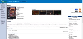
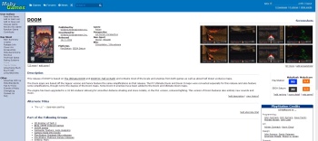
There was just a brief period where CSS was being fixed, everyone should reload again :) Example of a game page with the new style:
http://www.mobygames.com/game/windows/sid-meiers-civilization-ii
(Most changes were to top bar and individual game pages.)
chirinea (47495) on 2/3/2014 9:11 PM · Permalink · Report
OK, I don't know if I like how the screenshots are being displayed. I mean, it only shows 4 shots, in my resolution there's a lot of free space to both sides, maybe make it display a number of screenshots depending on the resolution of the user (I don't know if that is possible).
I like the huge name of the platform besides the name of the game.
CalaisianMindthief (8172) on 2/3/2014 9:14 PM · Permalink · Report
By the way, is there some way we're going to archive the feature articles? I agree that the panel should be removed from the frontpage, but I still want to access them somehow.
MobyReed (325) on 2/3/2014 9:21 PM · Permalink · Report
[Q --start CalaisianMindthief wrote--]By the way, is there some way we're going to archive the feature articles? I agree that the panel should be removed from the frontpage, but I still want to access them somehow. [/Q --end CalaisianMindthief wrote--] They can be found here: http://www.mobygames.com/featured_articles/view
vileyn0id_8088 (21040) on 2/3/2014 9:23 PM · Permalink · Report
Alright, but a publicly accessible link?
GTramp (81965) on 2/3/2014 9:29 PM · edited · Permalink · Report
Feedback? OK! The new header looks nice. But the revamped screenshots section not so (imo). While I understand that the idea behind this was to make thumbnails larger and easily accessible, I'd say the new screenies section gets in the way of the game's description. The area to the right, on the other hand, looks empty now. (Not all games have any credits or purchase links). Also, this "Buy" link looks bad with longer titles like this: http://www.mobygames.com/game/windows/fiction-fixers-adventures-in-wonderland-premium-edition
Terok Nor (42009) on 2/3/2014 9:33 PM · edited · Permalink · Report
Can't say I'm a big fan of having the screenshots above the description on the main page. Never mind that at my low resolution the 4th shot goes in the next row which looks ugly. Unless we're talking about very old games with large pixels, even at the slightly higher resolution compared to the old screenshot preview you can't see anything besides a blob of color most of the time. And I know many contributors take great pride in their descriptions and I think it's a shame those aren't at the top anymore.
Fred VT (25953) on 2/3/2014 9:40 PM · Permalink · Report
[Q --start ALAKA wrote--] [Q2 --start Terok Nor wrote--]Can't say I'm a big fan of having the screenshots above the description on the main page. [/Q2 --end Terok Nor wrote--]
Agreed. All games have descriptions. Not all games have screenshots. [/Q --end ALAKA wrote--]
At least put them under the description. That way it would seem like the screenshots complement the description.
vileyn0id_8088 (21040) on 2/3/2014 9:41 PM · Permalink · Report
I'd also prefer the screenshots to be on the side panel (perhaps larger than before - say display 3-4 larger thumbnails at a time, but cycle them with some light(!) javascript; just a thought). But, if they must stay above the description, I'd make the thumbnails somewhat smaller.
That would (1) allow more than 4 screenshots to be shown, and (2) restore a bit of prominence to the description.
Игги Друге (46653) on 2/4/2014 12:05 AM · Permalink · Report
[Q --start vile_r wrote--]I'd also prefer the screenshots to be on the side panel (perhaps larger than before - say display 3-4 larger thumbnails at a time, but cycle them with some light(!) javascript; just a thought). [/Q --end vile_r wrote--]
Even a light javascript becomes heavy when you run 25 instances of it.
vileyn0id_8088 (21040) on 2/4/2014 3:01 AM · Permalink · Report
Indeed - I think we all remember the GameFly lesson...
Lampbane (20955) on 2/3/2014 11:41 PM · Permalink · Report
[Q --start Reedx wrote--]Yeah, but look at it from the typical user's perspective. They generally want to get an idea of what the game looks like before reading an in-depth description. [/Q --end Reedx wrote--]
Is this based on studies? Traffic? Because honestly, I would prefer to get a brief summary of what the game is before I see any screenshots of it, because for some games, I would have no idea what I'm looking at unless I've been told what kind of game it is and how it plays.
Now, we do have genres and such listed at the top, but that's not where my eye goes because it's so small/understated in comparison to everything else. If it was retooled in order to be more visible, then maybe I'd be fine with the screenshots being above the description.
Rola (8483) on 2/3/2014 11:50 PM · Permalink · Report
You and I - we're the minority now. People around us are the picture culture... or worse yet - video culture. TL;DR First it was text being replaced by graphic emoticons, now these are being replaced by animated GIFs.
Yes, I find one of our greatest advantages (even over the old platform-specific sites) is that we have descriptions.
However visual identification is very important, especially for casual visitors.
We need to tweak it (like its position), but larger screenshot preview (best done with one random bigger shot) was a good decision.
Lampbane (20955) on 2/3/2014 11:59 PM · Permalink · Report
Oh no no no, I like images and I think they really bring a page to life. But if we're going to make something bigger or more prominent to increase visual appeal, I'd rather it be the game cover, not screenshots -- because not all screenshots are created equal, and some do a poor job of selling their game. Though, to be fair, some descriptions have the same problem...
(And yes, some covers are pretty crappy, but even having covers of dubious quality works for Wikipedia, when they actually have them...)
Simon Carless (1834) on 2/4/2014 3:04 AM · Permalink · Report
To be honest, I think it's even worse than that - I think nowadays, most people will use VIDEO to check out what a game looks like first. So we're all the way back two steps back as default, at 'text descriptions'. So since we don't have video, we'll try to play up screenshots in the short term, and work on video in the longer-term perhaps.
(Still open to other layouts, just need to have screenshots above fold and more obvious.)
GTramp (81965) on 2/3/2014 11:53 PM · edited · Permalink · Report
I prefer descriptions first. Also take a look at this layout when there's only 1 (and rather tall at that) screenshot: http://www.mobygames.com/game/nintendo-ds/petz-catz-2 . Doesn't look good at all.
Pseudo_Intellectual (66362) on 2/4/2014 12:10 AM · Permalink · Report
Uh oh, all my entries on text adventures are about to be derailed by expectations of what the typical user wants!
Pseudo_Intellectual (66362) on 2/4/2014 3:03 AM · Permalink · Report
Hm, have taken a look. I appreciate what with all the discussion about how Google Images-driven our traffic is the need to bump up the pretty pictures, so I can see the case for putting screenshots and cover art first. Prioritizing MobyRank and MobyScore over the description is a choice I can understand if not get behind... but why put the credits roll before the description? I'm seeing a lot of white space in the "published by / genres" section that could probably make room for at least the header paragraph of a description if those were consolidated more neatly -- a quarter of the top bar is taken up with "adventure, Fantasy, Interactive Fiction". (My case study is Zork 1 8)
Pseudo_Intellectual (66362) on 2/4/2014 3:34 AM · Permalink · Report
OK, I've poked around with a few different entries of games of various prominence -- Angry Birds Space, Chrono Trigger, Galatea -- and decided I can live with this layout on my PC. It would be nice if coverless / screenshotless games could devote a little more room to the content they /do/ have, but I appreciate the "WE DON'T HAVE ANY OF THIS" is indeed fishing for some.
The new sequence is more jarring when viewed on a mobile browser... doesn't matter how prominent the thumbnails are, I'm still not crazy enough to think it's a good idea to browse them there.
If they're as important as / more important than descriptions, will new game submissions eventually be required to have screenshots and credits included? Will descriptions always be required?
Patrick Bregger (301030) on 2/3/2014 10:33 PM · Permalink · Report
The description is the most important part of a game entry and therefore it needs to be on top.
Simon Carless (1834) on 2/4/2014 3:06 AM · Permalink · Report
For me, the screenshots, credits, and developer/publisher database info are the most important part of MobyGames - the descriptions are really important as well, mind you. (That's just how I see it.)
vileyn0id_8088 (21040) on 2/3/2014 9:33 PM · Permalink · Report
I like the updated look, but... it breaks the MobyDark skin. Please try to fix that? :(
formercontrib (157510) on 2/3/2014 11:23 PM · Permalink · Report
Not my thing: Shots before the game description.
MobyReed (325) on 2/4/2014 2:28 AM · Permalink · Report
Sorry, that is not being supported... It's going to go away and in the meantime I'd recommend switching back to Default.
We only have so many resources (e.g., very little) and supporting multiple skins properly is a lot of work that only impacts a small % of users.
vileyn0id_8088 (21040) on 2/4/2014 2:43 AM · Permalink · Report
[Q --start Reedx wrote--]Sorry, that is not being supported... It's going to go away and in the meantime I'd recommend switching back to Default.
We only have so many resources (e.g., very little) and supporting multiple skins properly is a lot of work that only impacts a small % of users. [/Q --end Reedx wrote--] Pity. I guess I could live with the default color scheme, I just prefer MobyDark since light-on-dark is generally much easier on my eyes. On the other hand, certain visually impaired users may find it to be a necessary accessibility option...
Havoc Crow (29859) on 2/3/2014 10:17 PM · edited · Permalink · Report
I like the big screenshots, they help you to see what the game is like right away. In my opinion, the way screenshots look now on the rap sheet is fine.
Simon Carless (1834) on 2/3/2014 10:18 PM · Permalink · Report
I actually dig the screenshots nearer to top of page as well (and that wasn't anything I recommended to Reed as a default) - although other elements like description get pushed down a LITTLE bit, it makes above the fold a much brighter and more pleasant place. And you still get to description pretty darn quickly...
Havoc Crow (29859) on 2/3/2014 10:21 PM · Permalink · Report
It doesn't look so good, though, when there are no screenshots contributed for the game. You'd expect the description to be the topmost section of text, the "There are no [platform] screenshots on file for this game..." text above it just looks jarring.
Rola (8483) on 2/3/2014 10:28 PM · Permalink · Report
Also for such texts "there is no..." I'd use smaller font, maybe even lighter color... if there's nothing we have on file, play it down, don't boast it, don't steal away user's attention.
This is universal problem, with many websites, even IMDb or BoardGameGeek suffer from this.
vileyn0id_8088 (21040) on 2/4/2014 2:22 AM · Permalink · Report
[Q --start Rola wrote--]Also for such texts "there is no..." I'd use smaller font, maybe even lighter color.[/Q --end Rola wrote--] Unless it's "There is no data, only Zuul!"
Indra was here (20755) on 2/4/2014 4:41 AM · Permalink · Report
[Q --start vile_r wrote--] [Q2 --start Rola wrote--]Also for such texts "there is no..." I'd use smaller font, maybe even lighter color. [/Q2 --end Rola wrote--] Unless it's "There is no data, only Zuul!" [/Q --end vile_r wrote--] Like. Seconded. Mandatory nerd humor is always a good thing.
Игги Друге (46653) on 2/3/2014 11:59 PM · edited · Permalink · Report
I don't see the point in moving screenshots from one place where they're visible to another one, making the description fall outside the window border.
Simon Carless (1834) on 2/4/2014 12:14 AM · Permalink · Report
Can we take a poll on what resolution you guys are running? For me description is plennnty above the fold, so maybe that's some of the issue...
Nélio (1976) on 2/4/2014 1:05 AM · Permalink · Report
[Q --start chirinea wrote--]1920x1080 here. I can see the entire description below the screenshots, but I still prefer to have the screenshots below the description, if we're going to keep it in the middle column. [/Q --end chirinea wrote--] +1 here
vileyn0id_8088 (21040) on 2/4/2014 1:29 AM · Permalink · Report
(1280x1024)x2.
Can't say I agree with having the screenshots below the description. I still say they'd be better off in the side panel, in a larger size than before.
I may not be hanging with the hip widescreen crowd, but widescreen is what most people are using and, in that respect, things are better laid out side by side than vertically.
Indra was here (20755) on 2/4/2014 4:42 AM · Permalink · Report
I think I'll just agree with anything vile says from here on end. :p
chirinea (47495) on 2/4/2014 11:06 AM · Permalink · Report
OK, now that I'm on my wife's laptop, I think I don't like the screenshots below the description anymore. For several of them I have to scroll the page to reach the screenshots, they're not visible from the start, so the earlier layout with the screenshots to the right worked better than this.
This reinforced my opinion that Nélio's solution seems to be the best so far.
Lampbane (20955) on 2/4/2014 3:06 PM · Permalink · Report
I tried it on an iPad last night before the screenshots were moved below the description, and it doesn't push the description down that much... unless we're talking about mobile screenshots. The portrait layout of many mobile screenshots did push the description down a bit far.
This was an example of a page I was looking at.
Game Guesser (28) on 2/4/2014 1:40 AM · Permalink · Report
Most changes look basically fine to me, if a bit odd in the incredibly particular and uncommon browser setup I have going at this moment (on this computer only). But I agree with those who say that the current situation of the screenshot box on top of the description text doesn't really work. I do understand the desire to make them more visible.
It might not be really feasible, but....what about a line of somewhat smaller thumbnails horizontally beneath the top block of information and beside the box art slot? Just a line of three or four screenshots loaded in randomly, without a "screenshots" title and visible line break. People would instinctively realize that the media exists to be viewed, and perhaps the old screenshots box could be put back beside the description and between the retailer box/ad.
Would it be too intensive to have a script that checks the thumbnail sizes before it loads a page, to make sure the ones in this theoretical top line are uniform in size? Also only drawing from a single platform if possible. Maybe check the resolution to determine the number of pictures to show there - for example, only two pictures if it's a DS game, or a single screenshot if the original is high resolution (x/y>1000) And this top box, instead of giving the usual "There are no..." message for games without screenshots, could maybe have a little box that says something like "Want to help us? We need screenshots of this game!"
Cavalary (11445) on 2/4/2014 2:05 AM · Permalink · Report
Oy, check this again and... Nice top bar, I like that, and the platform listed next to the game title. Not that big a fan of that large a text for title and platform though, and definite no go on those screenshots there. The description needs to be on top, and the two columns should be used so there will be as little empty space as possible left for most games with contributions in all relevant sections. They were doing just fine where they were, above the credits (as having them below the description in the middle will get them below the fold in case of more serious descriptions, which will be bad).
But after what happened with the old design, please no such scripts unless absolutely necessary.
What about a one-line, (relatively) small font, table of contents at the top, right above the description, only including sections with contributions of course? That way it'll be immediately clear what exists, and one click will scroll down to the respective section, so doesn't matter if it's below the fold? That'll allow for shots to still be in the middle if you insist, though it'll look as no less of a really bad idea to me, as long as they won't be above the description.
Nélio (1976) on 2/4/2014 2:45 AM · Permalink · Report
I just realized that we have a lot of dead space right on the top of the page. I did some experiments, and came up with this layout suggestion:
I think something like this would make everyone happy. Things I've done:
- Cover scan enlarged;
- All summary details in one column - some spacing between different elements;
- Screenshots in the top-middle section, between the details and the scoring.
Other variations of this layout would still work. We could still keep the summary info in two columns, and have the screenshots all the way aligned to the right. The scoring would then come below the screenshots. I tried slight variations, and the one above is the one I liked the most.
Cavalary (11445) on 2/4/2014 2:52 AM · Permalink · Report
That is interesting... Though I still have a big issue with screenshots above description. May need some tweaking for non-widescreen resolutions, to have 2 rows for the shots maybe, 2 on each. Or, if there are to be any scripts, determine the number of shots to display according to available width (and maybe fill 2 rows, not just 1, since that still leaves space).
vileyn0id_8088 (21040) on 2/4/2014 2:52 AM · Permalink · Report
You know, I don't dislike this. :) Two rows of (slightly smaller) screenshot thumbnails and it'd be even better.
Simon Carless (1834) on 2/4/2014 2:57 AM · edited · Permalink · Report
You took all the ads out of the mockup, though, which is how we pay for hosting :) Not sure if intentional...
Overall, I think me and Reed feel fairly strongly that having screenshots above the fold is important, but we're def. open for discussion about how that's gonna work.
Some of the descriptions are seeeeriously long too, eg: http://www.mobygames.com/game/star-control-ii - so we're trying to work out if those could be flowed to extra page or just kept that long.
Nélio (1976) on 2/4/2014 2:59 AM · edited · Permalink · Report
[Q --start Simon Carless wrote--]You took all the ads out of the mockup, though, which is how we pay for hosting :) Not sure if intentional... [/Q --end Simon Carless wrote--] Hah, sorry about that! My browser blocked the ads.
EDIT: Just checked the page with ads enabled and the suggested layout still works.
Indra was here (20755) on 2/4/2014 4:52 AM · Permalink · Report
[Q --start Simon Carless wrote--]Some of the descriptions are seeeeriously long too, eg: http://www.mobygames.com/game/star-control-ii [/Q --end Simon Carless wrote--]My review on that game is also the longest on file. Sixteen pages. :p
Cavalary (11445) on 2/4/2014 1:51 PM · Permalink · Report
... Yeah, filing these (as well as the "two steps behind" due to not prioritizing eye candy part) under major red flags regarding the new direction, with the GF snafu firmly in mind.
That said, if the old placement is absolutely out due to catering to the whims of silly new crowd, I'd still go with Nelio's idea with some added way to determine how many thumbnails to display there depending on window width, to completely fill the space (assuming enough shots exist) but not spill over or look weird (as in uneven rows). And maybe remove the "screenshots" section title too, I mean it's obvious what they are.
Игги Друге (46653) on 2/4/2014 5:43 AM · Permalink · Report
[Q --start Nélio wrote--]I just realized that we have a lot of dead space right on the top of the page. I did some experiments, and came up with this layout suggestion:
[/Q --end Nélio wrote--]
On my browser, that space is crammed. I have a widescreen monitor (not on the machine I'm typing this on, thouigh) and run one MG page next to another window with something else, such as another MG page or a reference or the screenshots I'm entering credits from and so on.
Игги Друге (46653) on 2/4/2014 5:49 AM · Permalink · Report
Or publisher information and genres can be moved into the right column, freeing the space on top.
Indra was here (20755) on 2/4/2014 4:00 AM · Permalink · Report
Mobydark users constantly suffer discrimination. :p
Indra was here (20755) on 2/4/2014 4:39 AM · edited · Permalink · Report
I'll keep using MobyDark even if they take it away from me!
Moving on...
They say you can't make everyone happy, but to me that's a lazy answer, specifically in web design. Though it would depend on resources actually. If users have the option to change the layout to their liking, it would even make those Scandinavian hipsters happy. Which is quite a feat in itself.
It would solve the issue of small old permanent loyal users (yes, I said old, you relics) vs. large infrequent users. The old users like the old layout and are illogically adamant about how important descriptions are (despite constantly refusing to put anything more informational than a book summary in it). The new users presumably prefer videos over screenshots. Judging from the Steam layout, that may be true.
Unfortunately, we cannot prioritize on videos and screenshots. Unlike most commercial gaming websites, our strongest asset also has its disadvantages. A user contribution system only allows certain features to be mandatory. In our case, new games will only require descriptions and release info. Screenshots and videos are not mandatory, hence prioritizing them in the layout will make us look like GB with a lot of no information available previewed up front. And that's just bad. Other gaming websites do not have this issue.
My personal analysis, due to the lack of resources is to either adapt that 1 big screenshot + 2 screenshots layout or just 1 big screenshot. The small thumbnails is noticeably not noticeable for the random user to be of any importance.
I've also noticed that the right panel is usually sparse when it doesn't have credits. I'd still go with this order: 1 big sample screenshot; 1 big sample video; credits.
Putting screenshots under the descriptions does pose the question: what happens when a game has a long description? When my sulking period ends, which is probably until the next Armageddon warning and I'll contribute long descriptions again, will the screenshots from view at first glance?
Also, why is the title font so large? I know the internet crowd is grammar blind, but are they also short sighted? o_o
MobyDark will survive!
Nélio (1976) on 2/4/2014 5:02 AM · edited · Permalink · Report
[Q --start Indra was here wrote--] Also, why is the title font so large? I know the internet crowd is grammar blind, but are they also short sighted? o_o [/Q --end Indra was here wrote--] Yes, it's a bit too big, and I'd also drop the underlined links. They could underline on mouse over, though.
vedder (70810) on 2/4/2014 8:04 AM · edited · Permalink · Report
I like it. I think how you have it now with the screenshots below the description is the best solution.
I definitely think the layout of the header is a big improvement. The random game button makes much more sense there, time to remove it from the user actions on the left, that always felt weird to me :)
The link to the forums now has a much more visible and prominent place which it deserves as it's the heart of the community we have here.
I hope the advance search will continue (it allowed to search for users and do a full description search, which was very useful for finding contenders for game groups), but I could always revert to google site search.
Keep up the good work!
formercontrib (157510) on 2/4/2014 8:21 AM · Permalink · Report
Better again, with the shots under the description imo - but the thingie made by Nélio is still my favorite so far :)
Nélio (1976) on 2/4/2014 2:27 PM · Permalink · Report
Just did a couple more layout tests, given the latest comments and trying to accommodate the different resolutions that people are using. Please bear in mind that the admins want the screenshots visible on the top of the page, so there's not point in lobbying for them to stay under the description (which I actually like, but I understand their point in making the screenshots more visible).
So, here are those layouts (sorry, no ads again!):

- Cover size reduced a bit (still larger than it is now).
- Back to two columns in the game specs, but closer together instead of spread out in the available space.
- Screenshots now aligned to the right.
The first layout has a single row of screenshots. I duplicated it in the second layout mostly because I wanted the MobyRank/Score elements to be aligned with the description instead of kinda lost in there. 8 screenshots may be a bit overkill, though. Perhaps this combined with the screenshots layout Rola posted above (1 big, 2 smaller), would work great.
EDIT: Heck, here goes that layout:

MobyReed (325) on 2/4/2014 4:51 PM · edited · Permalink · Report
I think the 3rd one could work - seems it might fit down to 980px wide? (that's the smallest width we need to support)
And I really like that screenshot layout, but would have to figure out a way to standardize the resolutions first. Currently that would be a mess with a lot of games. :(
Would also have to try and make the cover shot height match up w/ the screenshot heights... Those resolutions are also all over the place. For example, consider the case of mobile games. The cover would be short and the screenshots really tall, which would leave a big awkward empty space.
MobyReed (325) on 2/4/2014 5:25 PM · Permalink · Report
You can scale down and screenshots will still look ok, but not up. That results in a lot of distortion/blurriness, except in the case of pixel art (and only if using nearest neighbor scaling).
And it's not just height/width you have to worry about, but the dimensions. A lot of games have screenshots with mixed ratios.
You'd see a lot of stuff like this:
Nélio (1976) on 2/4/2014 5:55 PM · Permalink · Report
I think that both the cover scan and the screenshot thumbnails should have a fixed height, and let the width be whatever it is, depending on the aspect ratio. I don't mind that some of the thumbnails in the batch will end up being less wide than the others. It's something we'll have to live with. But as long as the height is some fixed value, the overall layout will look good.
The exception could be portrait games, as Lampbane pointed out. The best screenshot layout for those would be 3 shots side by side. I think it's a matter of the server verifying the orientation of the shots and selecting the appropriate thumbnail layout.
vedder (70810) on 2/4/2014 7:23 PM · Permalink · Report
It would look really weird for phone or arcade games which are played in portrait orientation. Because of that I'm not a fan.
Also I often have two windows next to each other side by side on 1080p, is there still enough room then to cram things together? There is now in the current layout.
Nélio (1976) on 2/5/2014 12:34 AM · Permalink · Report
[Q --start vedder wrote--]It would look really weird for phone or arcade games which are played in portrait orientation. Because of that I'm not a fan.
Also I often have two windows next to each other side by side on 1080p, is there still enough room then to cram things together? There is now in the current layout. [/Q --end vedder wrote--] As I said, portrait screenshots would work great, but with a different layout. The 3 thumbnails simply side-by-side. It would take up approximately the same space as the 1 big + 2 smaller thumbnails of landscape shots.
On the other issue, I think there's more than enough room. If you check my last layout (the one with the 1+2) there's a lot of free space over there. It's a bit less than there is now, but not by much.
Pseudo_Intellectual (66362) on 2/4/2014 7:28 PM · Permalink · Report
Is there any potential to situate game-related information (title?) in the vast blue space in the header bar between the search window and the messages/notes/points ticker?
Parf (7873) on 2/4/2014 2:56 PM · Permalink · Report
I like what's happening with the top border as well! Keeps the style while feeling modern. You don't have to throw everything and the kitchen sink at the site at once to make it look nice, and this is proof. :)
As for screenshots, the top right side is my favorite so far as well. Mainly because the attempts above and below the description made for some odd line breaks with three shots above and one below on my phone, and it felt empty on my computer monitor.
Overall though, I'm liking this change business the way you guys go about it. :)
MobyReed (325) on 2/4/2014 7:28 PM · Permalink · Report
Thanks! We're really trying to strike a balance with bringing Moby into the modern age, while keeping in mind those who have been coming here for a decade+ and are used to the way it's always been. We're reading every comment and taking them into account.
A big part of the challenge is that much of the site hasn't evolved for a very long time. Unfortunately there's no avoiding breaking some eggs in this process... Literally any change will upset some people. And I'm sure we'll make some mistakes along the way, but hopefully most will keep an open mind as things evolve.
We just want MobyGames to survive and ultimately thrive. Its usage and relevance has been on a downhill trajectory for years, and that's something that needs to be reversed. So we've been adding missing platforms/etc and working to bring the site forward as a whole.
chirinea (47495) on 2/4/2014 7:59 PM · Permalink · Report
[Q --start Reedx wrote--]Unfortunately there's no avoiding breaking some eggs in this process... Literally any change will upset some people. [/Q --end Reedx wrote--]The best way of not upsetting the people around here is to avoid removing features. Most of the bashing against GameFly's redesign wasn't related to the visual aspect per se, but to features missing/not working. So far you guys have done an awesome job in improving (and not removing) the functionality of the site.
CalaisianMindthief (8172) on 2/4/2014 6:24 PM · Permalink · Report
I'm wondering if the title of the games would look better in a color more compatible with the bright layout of the rest of the site.
Foxhack (32100) on 2/4/2014 9:26 PM · Permalink · Report
There's a layout issue in company pages. The text in the "Most Recent Games" box is huge and out of alignment.
http://www.mobygames.com/company/wayi-international-digital-entertainment-co-ltd
Joshua J. Slone (4666) on 2/5/2014 1:20 AM · Permalink · Report
Late to the party, but wow. It's been a long while since I was a very frequent visitor, so when I last stumbled in a few months back and saw all the dissatisfaction and people giving up on the site it was quite the bummer. When I arrived here today by way of a Google Image search my interest was piqued when I noticed the old logo was back. Nice!