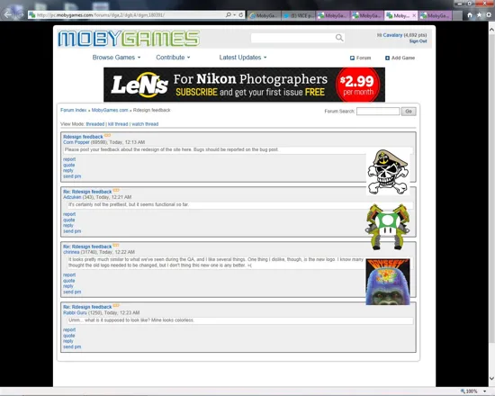
Forums > MobyGames > Redesign feedback
Corn Popper (69027) on 9/11/2013 9:13 PM · edited · Permalink · Report
Please post your feedback about the redesign of the site here. Bugs should be reported on the bug post.
The Fabulous King (1332) on 9/11/2013 9:23 PM · Permalink · Report
Umm... what is it supposed to look like? Mine looks colorless.
Hypercake (1310) on 9/11/2013 9:36 PM · edited · Permalink · Report
Seems I posted in the wrong thread right after this thread was opened. I'll paste it here too (seems it says Cavalry wrote this. dunno why):
[Q --start Alex M. wrote--]Ah, been used to the old design for too long. It's okay, I like it. I'd have also hidden the terribly outdated "This day in gaming" while at it. It makes the whole website look outdated :) [/Q --end Alex M. wrote--]
panpan wang on 9/27/2013 3:35 AM · Permalink · Report
Essential need of the idol is the foods so they must get ready the real foods to get situated durable presently individuals are not being careful to the [url=http://www.mmotank.com/]WOW Gold[/url] and also overall wellness and wellness and you. The real foods is the person to reside in long it has to be manufactured from this better [url=http://www.topdiablo3.com/]Diablo 3 Gold[/url]. There are a lot of organic products are enhancing around the globe which may be useful for a foods for getting [url=http://www.4runescapegold.com/]Runescape Gold[/url] and wellness and fitness enhancement.
Nowhere Girl (8680) on 9/11/2013 9:37 PM · Permalink · Report
Terrible, to be honest. Not even functional, I'm having trouble finding my way around. I realize somebody must have put some work into creating this new design, but I would be happy to see "the old version" return. Why do people change things that work just fine?
Fred VT (25953) on 9/21/2013 12:12 AM · Permalink · Report
[Q --start Nowhere Girl wrote--]Terrible, to be honest. Not even functional, I'm having trouble finding my way around. I realize somebody must have put some work into creating this new design, but I would be happy to see "the old version" return. Why do people change things that work just fine? [/Q --end Nowhere Girl wrote--]
You should also change your nickname. How about "Nowhere to be found after Moby died Girl"?
HALXP (2) on 11/5/2013 7:42 PM · Permalink · Report
I agree - Terrible! The site has become useless for me. Please give me a way to use the old layout or a way to export my collection to excel or something so I can view my stuff!
I liked to see my games for one console in 1 or 2 pages/screens. I used to use the 'notes field to EASILY track which games I've lended to which friend, I now have to browse 20 pages and look at each game to get the info (instead of just checking the 'notes' column.
lilalurl (733) on 9/12/2013 6:50 AM · Permalink · Report
Clickable thumbnails
On Chrome (last version), there is no New column and columns need a wider separation.

On Firefox ("old" version, 3.6.X), the New colum is here, but the readability is even worse (Is that 167650 posts or 16765 posts and 0 new posts?)

Daniel Saner (3503) on 9/11/2013 9:35 PM · edited · Permalink · Report
So far I don't see anything I terribly dislike (apart from the bugs of course).
What I see though is that the layout has remained at the very narrow width it had in the preview. Especially with two relatively wide sidebars on game pages, this makes the content area extremely narrow. For example the screenshots will display very small unless the full size version is opened. Maybe there should at least be a setting in user preferences to switch to a fluid/full-width layout.
Edit: second thing, the game listing (e.g.) are a bit unstructured now for my tastes. A lot of wasted space and arbitrary alignment. It's hard to make out platforms and years when they're not aligned in a tabular fashion. Edit2: The user contribution history page is a good example of how I think tabular data should look. Clean yet compact so you can see a lot of information at a glance, and nicely aligned.
chirinea (47495) on 9/11/2013 9:37 PM · Permalink · Report
[Q --start Daniel Saner wrote--]So far I don't see anything I terribly dislike (apart from the bugs of course).
What I see though is that the layout has remained at the very narrow width it had in the preview. Especially with two relatively wide sidebars on game pages, this makes the content area extremely narrow. For example the screenshots will display very small unless the full size version is opened. Maybe there should at least be a setting in user preferences to switch to a fluid/full-width layout. [/Q --end Daniel Saner wrote--] What Daniel said. The right column with a single "buy this game" on game pages is pretty useless and should be narrowed or completely removed. Also, I don't like how the ratings and rankings are down to the end of the page, I miss those closer to the top.
j.raido 【雷堂嬢太朗】 (95234) on 9/11/2013 9:38 PM · edited · Permalink · Report
Please to return the option to view game collections (collections, contributions, etc...) as a text list. The covers view is cool -- if a bit limited by only having two columns -- but cumbersome for actually browsing collections and such. I'm used to having 100 listings on the page, so being stuck with 18 is... not good.
Having the option to switch on the fly would be awesome.
MichaelPalin (1414) on 9/11/2013 9:49 PM · Permalink · Report
(trying to stay calm and constructive) I will see how it goes after using it for some days, it's not fair to judge new layouts just after having the first look at them. And I bet there are many new functionalities to discover. However, I must say that the smartphone/tablet layout (content spaces thinned horizontally) is..., is..., I don't know, but if the argumentation behind it is that a lot of people read the internet now on smaller screens, it's quite the kick in the balls for those who don't. I remember a time in which websites would recognize what device each reader was using to access the site and accommodate to it. Is that too difficult to do? The internet is becoming more and more hostile when half of the sites I visit present giant bars of void for no good reason. Please, don't tell me that you don't see this as a problem too.
feisty on 9/11/2013 10:00 PM · Permalink · Report
The new design is too monotone. Certainly, the old color palette showed its age, but now it seems it's like a film noir site and it almost looks like a "white/gray" to me which isn't very pleasing. With this I mean the gray and it's subtle variants are used all over the place which IMHO lack giving things proper structure or relation. It's almost like the site lost its personality in some way. Reminds me a bit about sourceforge, also not very appealing and is living past its days already.
The issue of using space has already been mentioned. So much space is given away for no content. I'm not saying making things more dense. Maybe it's the "framing" (border around) the whole site which makes it appear awkward in some way. Don't see many pages having this, gives a kind of claustrophobic feeling.
Also, viewing the site on mobile doesn't show an improvement. Having a redesign in 2013 and not making a site mobile compatible is a lost opportunity IMHO.
Just an example for structure and color looking at http://www.webmd.com/ (I'm not affiliated with them nor is this a stance on their fidelity, however these things I like): just using colors for titles instead of gray bars makes it so much more pleasant to look at and things don't feel to "boxed" although they're structured.
Well, you can't make everyone happy, can you :-)
HTH
Risingson (15) on 9/11/2013 10:27 PM · edited · Permalink · Report
There are things one can be used to, like the new logo, the colour palette, or even the waste of space (something I saw in other awful redesigns like allmusic or imdb). But what I don't like at all is how this new design tries to be less about a game database, less about the users. I cannot sort game lists now. The game page now hids the user reviews, burying them at the bottom instead or making you see, at one sight, the game, the company, screenshots, some reviews and even the board.
Seriously, if a site needs this kind of redesign just because the old one was "old fashioned", some things are very wrong. This design is now schizophrenic: it is aimed for tablets but it is not mobile compatible, and I really think that the harm to the informative capabilities are intentional. Which is a pity.
EDIT: what? either this message has been edited to make it appear with grammar mistakes, or I am going crazy now
Daniel Saner (3503) on 9/12/2013 4:10 PM · Permalink · Report
[Q --start Risingson wrote--]EDIT: what? either this message has been edited to make it appear with grammar mistakes, or I am going crazy now[/Q --end Risingson wrote--]
They're trying to discredit you!
MichaelPalin (1414) on 9/11/2013 10:22 PM · Permalink · Report
I had not noticed the "buy this game" something (it seems to be a work in progress thing, so I don't know how to call it). I assume it's going to develop into some kind of advertising deal with different stores, is it? We need to have a talk about that. While adblock sadly does not remove that type of advertisement, I think the more progressive way of approaching advertisement nowadays is to give readers an option to remove all ads from the site by making a donation of a minimum quantity. Please do that, there are people like me who understand that money is needed for projects like this and is happy to make donations once in a while when we are reminded. But donations and ads are not compatible. If I make a donation of whatever sum and regularity you find fair, it is also fair that ads are removed when I log in to the site. Please. Either that or adblock will eventually break the ad-based internet and only the site with an alternative will survive. It's the apocalypse, I say!!
vileyn0id_8088 (21040) on 9/11/2013 11:21 PM · edited · Permalink · Report
NoneGTramp (81964) on 9/11/2013 10:49 PM · edited · Permalink · Report
Forum looks broken - overlapping avatars and misplaced buttons (FF23).
Gamegroups are harder to navigate - you need to scroll much more than before to get to game you need.
Also - no new screenshots preview on main page? I just see screenshots descriptions.
No new credits at main page anymore?
Also - new contributions IMO should be placed above "This Day in Gaming".
Also - need to see messages from approvers and work in progress items in some form on the main page - like it was in old design.
Only 20 top contributors? Can't see beyond that limit.
Game description page doesn't look good to me... Why alternative titles are links? Is there a way to group release info so that it took up less space? In cases like this http://www.mobygames.com/game/realms-of-arkania-star-trail you need to scroll down to read game's description and the description itself is completely lost in the info that surrounds it. Maybe it's possible to use space to the right too? "Buy this game" and "Did You Know?" only use a bit of vertical space and the remaining space to the right is just blank, unused, while the center of the page is overloaded with info.
How do I edit "now playing", "recently finished" and similar lists? Also, comments to games in "recently finished" etc. are gone.
And most important - how do I continue work in progress? I can't do anything to an entry I started yesterday!!
Also - what about BB code menu or smth like that to simplify formatting?
GAMEBOY COLOR! (1990) on 9/11/2013 11:18 PM · Permalink · Report
The content on screen really is too narrow. This isn't kotaku. Moby Game is not a fucking blog, it's a game documentation site. It's too dark, there's tons of visual bugs, and content is actually HARDER to get at. The way screenshots are handled really pisses me off though. Why not have the full version come up in a separate window with navigation buttons instead of the clunky mess that we have now? How hard is simple web design? I've gotten considerably more cranky in the few minutes since my last post, and it's not getting any better.
vileyn0id_8088 (21040) on 9/11/2013 11:22 PM · edited · Permalink · Report
Uhm... wow.
I'll try and refrain from commenting on the purely visual changes, which are just a matter of taste after all - one gets used to them after a while. But usability is a whole different ball game, and layout changes should never, ever make the site less functional than it previously was.
I'm talking about things like:
- • Listings have *way* too few items per page - making it necessary to click a whole lot more to view the same amount of information as before (18 per page for user contributions? 25 per page in the game browser? *why*?!)... Certain areas still show nice, well-ordered lists instead of huge tiles - e.g. developer's gameographies, or clicking on a tech spec. There should definitely be an option for having the list-style view everywhere, or at the very least, let the user specify how many items should be shown per page.
- • The game browser being broken, with some attributes completely inaccessible, even after selecting "show all". Example: can't find a way to access the attribute CGA (Tweaked) from the game browser. Though perhaps I should give this one the benefit of doubt and assume that it's a bug.
- • Main container is too narrow for most screenshots, unless they're smaller than 440x275 (?!) - a size which is really a bad fit for most platforms, as is immediately apparent in the new screenshot browser.
- • Game lists cannot be sorted, and the "filter" dropdowns are... limited, to put it very mildly.
- • No way to view the "new platforms for existing games" added by a user. Previously the "List games added" option included those games, but now it's gone.
Frankly, these shortcoming make the new design feel as if it was barely even tested prior to launch. The problem here is crippled functionality - not a matter of visual taste - and one has to wonder about the sort of planning (or lack thereof) behind it.
Keep the new style and color scheme if you must, but please address the usability problems. I'm not averse to change... if it's done right.
chirinea (47495) on 9/11/2013 11:32 PM · Permalink · Report
[Q --start vile_r wrote--]Frankly, these shortcoming make the new design feel as if it was barely even tested prior to launch. The problem here is crippled functionality - not a matter of visual taste - and one has to wonder about the sort of planning (or lack thereof) behind it. [/Q --end vile_r wrote--]The approvers have tested it, lots of those issues have been reported, but it seems they decided to launch the new site without fixing what we've pointed out.
vileyn0id_8088 (21040) on 9/12/2013 12:01 AM · Permalink · Report
[Q --start chirinea wrote--] The approvers have tested it, lots of those issues have been reported, but it seems they decided to launch the new site without fixing what we've pointed out. [/Q --end chirinea wrote--] Oh well.... at least I've gone from wondering to knowing.
POMAH (66430) on 9/11/2013 11:44 PM · edited · Permalink · Report
Not much words about redesign - it is awful. My first thought was that it was a hacker's attack on the mobygames.com to make it bad (today is anniversary of tragical event in US occurred on September, 11). This was also accompanied by background image on the home page (link to this image is http://pics.mobygames.com/images/redesign/bg.jpg ). This image has also a text in its center "Please, do not post this wallpaper online" and something like "...famous developer Sucker Punch...". Is it hackers` attack?
Sorry, but please return old design (in common) back, PLEASE!!! This kind has a very little useful improvements, but the site looks itself is very bad. It is NOT addictive, informative, intuitive, etc. There is no accents or proper highlights. Tables available at one page (without scrolling) is substituted with a sheet of some info crap that needs to be scrolled down and up. Most useful info (such as screenshots or credits) is hidden somewhere at the bottom and it is very limited in quantity of items. Screenshot loading performance is very low. I've waited a great amount of time to see a certain screenshot. And more, more, more bad issues....
Cavalary (11445) on 9/12/2013 1:02 AM · Permalink · Report
A hacker attack would be a good alternative, at least then they'd restore from a backup (unless they'd pull an AVault on us) and get back to something functional within at most a few days. But this was done on purpose... So good luck to you all, I'll be taking an occasional glance to see whether anybody up there will regain their wits (highly doubt it).
Pete Rocha (54) on 9/12/2013 12:55 AM · Permalink · Report
There are some things I like and some that I don't, but I think one of the most important items is your collection page, that's enormously difficult to navigate now with only 15 items per page and all of them icons. Filtering by platform doesn't do anything except sort on platform, so say I chose "Xbox" from the drop down menu, I'd still have to page back dozens of pages to reach my Xbox games. I'd like to see options for up to 100 results per page, true filtering rather than sorting, and the ability to switch between an icon view and a list view. Thanks.
The Fabulous King (1332) on 9/12/2013 1:12 AM · Permalink · Report
The biggest problem for me is the color, or lack of it. It just doesn't look good... and the forums are still crappy.
The new design just looks cold. And lifeless.
Indra was here (20755) on 9/12/2013 3:15 AM · edited · Permalink · Report
Anyone up for a suicide pact? 'Cause I really want to kill myself every time I look at this new redesign. Good lord, my eyes.
Full screen. For the love of gawd, someone give me full screen. And spaces. And paragraph breaks.
Slug Camargo (583) on 9/12/2013 4:05 AM · Permalink · Report
I don't mean to sound harsh, but in all honesty the first thing I thought when I entered (I went straight to the forums page) was that there had been some issue with the .com and it had been hijacked by one of those .com-hijacking companies. The whole thing looks way too generic, and the color palette is rather lifeless.
Also, the font (both face and size) is not very easy on the eyes, especially when reading long paragraphs.
Indra was here (20755) on 9/12/2013 5:04 AM · Permalink · Report
[Q --start Dr. M. "Schadenfreude" Von Katze wrote--]I don't mean to sound harsh... [/Q --end Dr. M. "Schadenfreude" Von Katze wrote--]Who are you and what did you do with the doctor?
Trixter (8952) on 9/12/2013 5:03 AM · Permalink · Report
Considering that the original design has stuck around since 1999 when Brian and I first started, I think the overhaul was a good thing. It is now mobile-friendly, for example. As for everything else, I'm sure the kinks will get worked out in time.
My only "gripe" is that it is now fixed-width instead of flexible.
Trivia: Accessing through lynx still shows our original ASCII logo! Woohoo!
Daniel Saner (3503) on 9/12/2013 4:17 PM · Permalink · Report
You're still around? Wow, that's fantastic! =)
There are a lot of little things I don't currently like about the site, mainly to do with tables and their spacing/alignment/sorting/filtering which I think is central for a database site. But I agree that the very narrow fixed-width layout remains my number one complaint. I have at least 100% more screen real estate than the site is currently using.
Игги Друге (46653) on 9/13/2013 1:52 AM · Permalink · Report
[Q --start Trixter wrote--]Considering that the original design has stuck around since 1999 when Brian and I first started, I think the overhaul was a good thing. It is now mobile-friendly, for example. As for everything else, I'm sure the kinks will get worked out in time.[/Q --end Trixter wrote--]
Nice of you to drop by.
While you're still here, do tell us, how much did you get from the sale to Gamesfly? All we got was a destroyed web site.
Unicorn Lynx (181775) on 9/14/2013 3:05 PM · Permalink · Report
Oh wow, I just noticed this.
Jim Leonard, the founder of MobyGames, likes the re-design.
There are only two possible explanations:
1) He sold his creation - a his soul with it - to GameFly for an undisclosed sum.
2) He is being held hostage, tortured, and forced to write this.
Not sure which one is worse.
Trixter (8952) on 9/17/2013 5:33 PM · Permalink · Report
[Q --start YID YANG wrote--] Jim Leonard, the founder of MobyGames, likes the re-design. [/quote]
I didn't exactly say that. I said that the redesign to update the site for modern browsers like tablets was a good thing. I am reserving judgement for a few weeks as kinks get worked out.
Unicorn Lynx (181775) on 9/18/2013 1:31 AM · Permalink · Report
Kinks??? Man, I can't believe this. YOUR site, one that exists thanks to you, is being ruined, the community that YOU initiated humiliated and driven desperate, YOUR once titanic project publicly ridiculed all over the world - and all you can say is that??
Do you realize that this might very well be the END? And you don't care? You don't want to stand up, contact your higher ups and save your child? Oooooh, I forgot - you sold it too. You, Rob and Brian will smile and say "good work, sir!" to your new bosses even if they beat MobyGames to death and rape its corpse.
I expected that from Corn Popper, but you... This is a nightmare.
Patrick Bregger (301035) on 9/12/2013 6:24 AM · Permalink · Report
Who had the moronic idea to destroy all my different have and wishlists? I also love how pretty much all concerns reported during the approver test phase have been completely ignored.
chirinea (47495) on 9/12/2013 6:28 AM · Permalink · Report
[Q --start Patrick Bregger wrote--]Who had the moronic idea to destroy all my different have and wishlists? I also love how pretty much all concerns reported during the approver test phase have been completely ignored. [/Q --end Patrick Bregger wrote--]Yeah, I've complained about this before (during the QA and now). Man, all the work put into those lists, saying how much I've paid for every game, when I bought them and all that stuff, now gone. I really hope the info isn't just gone but only hidden.
And to think I was telling myself to make a spreadsheet with all that info in case my lists here were gone... it's too late now, it seems.
Patrick Bregger (301035) on 9/12/2013 7:08 AM · edited · Permalink · Report
I would think so. My lists have not been merged, it just shows me the one which used to be on top. But it counts all in my overall game count.
Rola (8483) on 9/12/2013 6:26 AM · Permalink · Report
I know too well that designing a new dynamic content website is a chore and redesigning existing one is even worse. MG required an update (some say even a redesign). However I don't like changes for their own sake, I want to see benefits. Current redesign version reminds me of those sneak previews we saw on the forum and which we rejected.
-
still no editor buttons on the forum and in other textboxes. You don't expect forum users to type HTML by hand to format posts? < br > for every linebreak? Klaster's Opera plugin no longer works, so I experienced functionality setback. Forum could also use permalinks to posts (not sure if it's possible in your old script).
-
do all websites have to be made with the rule "tablets first"? I understand "compatible with tablets" but... what resolution is the new design aimed for? Plenty of vertical space wasted.
-
main layout: "This Day in Gaming" should be to the side and list only; why so huge "Top Contributors" module (full screen height) - if anyone wants it at all on the main page(?) use list only (nickname, points)
-
I used to have several "have lists" for different purposes ("add screenshots"; not just "games I own") - are we now supposed to have just one? are the old ones gone?
-
"work in progress" items no longer over the top of main page, now only hidden in "Show approval status of items contributed" (easily overlooked)
Does the redesign means we can finally remind about our feature requests/suggestions we formerly had?
Are we going to get the fixes we asked for? Does this mean the return of new platform updates (last one 9 months ago)?
Dar Gary (156) on 9/12/2013 6:58 AM · Permalink · Report
So I'm guessing the same people behind Youtube took were hired to do MobyGames' redesign?
1-Why the javascript screenshots? I hate needless javascripting.
2-The search results were better in the older version. A quick manipulation of what results to show, and for what platform.
3-Game ratings don't really need so much space.
4-The games group/series layout was better and clearer on the old page. Atleast I was able to re-order them from older to newer.
Maybe Mobygames should have asked for feedback and recommendations BEFORE changing the site?
Patrick Bregger (301035) on 9/12/2013 7:00 AM · Permalink · Report
Oh, they did ask for feedback from the approvers. And then ignored it.
Игги Друге (46653) on 9/13/2013 1:49 AM · Permalink · Report
[Q --start Dar Gary wrote--]1-Why the javascript screenshots? I hate needless javascripting.[/Q --end Dar Gary wrote--]
Amen.
[Q --start Dar Gary wrote--]Maybe Mobygames should have asked for feedback and recommendations BEFORE changing the site? [/Q --end Dar Gary wrote--]
They did. And promptly ignored them in the old and tried MobyGames fashion.
Cantillon (77154) on 9/12/2013 11:16 AM · edited · Permalink · Report
I think the old design showed its age, and a redesign was not a bad idea. But there certainly are things that can be improved. For one, I do agree with all comments that it looks kind of dull. Why not play around with the MobyGames colors a bit? Something simple as this already looks less gray and uniform:

Btw, I also do find it insulting that feedback given by users who are on this site every day was plainly ignored.
vileyn0id_8088 (21040) on 9/12/2013 1:13 PM · Permalink · Report
That does look quite a bit nicer. Though on the off chance that anyone's listening, the priority should be on fixing broken functionality rather than cosmetics.
I mean, the usefulness in 2013 of a fixed-width layout with a central container that isn't even wide enough for 640-pixel screenshots can be debated - but show-stopping bugs like being unable to access one's inbox, to continue a WIP contribution, or to properly sort and browse listings (the ones that haven't been removed, that is) are somewhat more important.
Oh, and where did the Featured Games go? Or are user-driven community features like this no longer important?
Patrick Bregger (301035) on 9/12/2013 1:00 PM · Permalink · Report
Why are the polls gone? There is an obvious one to start right now.
I might just have answered by own question.
Patrick Bregger (301035) on 9/12/2013 1:35 PM · edited · Permalink · Report
Seriously, the only correct answer to this mess would be to quickly rewind to the old design and actually work on this one. You know, instead of just looking at it like the last eight months. There is almost no improvement from the version they made available to approvers in December 2012. I don't grow tired of emphasizing that they did not even bother to fix the bugs we reported.
Of course I realize this won't happen.
Unicorn Lynx (181775) on 9/12/2013 2:44 PM · Permalink · Report
Wow. 12 years of my work on this site ended with this hideous piece of shit with half of essential features completely removed.
Not a pretty good-bye, but one filled with sadness and powerless anger.
CalaisianMindthief (8172) on 9/12/2013 3:53 PM · Permalink · Report
The redesign is a very sad attempt. None of the issues pointed out by the approvers before have been rectified. The most important being lack of color, small page sizes, disregard for logical placement and waste of free space.
Tomas Pettersson (31846) on 9/12/2013 6:05 PM · Permalink · Report
I think this Dilbert strip pretty much sums up my reaction to the redesign: http://dilbert.com/strips/comic/2002-09-23/ I know, not very constructive.
piltdown_man (236385) on 9/12/2013 6:32 PM · Permalink · Report
Aaaah Dilbert. I used to read that every day when I was working. Haven't touched it in years. thanks for the reminder, now I have something to do until the database settles down

Havoc Crow (29859) on 9/12/2013 9:45 PM · Permalink · Report
Change the body font. Make it black instead of dark gray, make it bigger, and add some line spacing! Right now the text is a mess, almost a solid blob.
I just noticed that the logo up there isn't defined as an ordinary link (cannot be opened via right-click), so it's impossible to easily open the main page in a new tab. Annoying.
The "This Day in Gaming" feature is far too prominent, especially with most of it filled with the ugly "no cover art on file" images. (Not all games even have a cover, a lot of downloadable freeware games for instance...) I've got a lot of doubts about "Top Contributors", too--does it really deserve so much space on the main page?
It's pretty annoying that the screenshots are hidden down "below the fold", making the cover (if there is any!) the only thing standing out in a sea of text.
Indra was here (20755) on 9/12/2013 11:15 PM · Permalink · Report
[Q --start Cantillon wrote--]That's what bugs me the most actually. Not a single reply from one of the owners. [/Q --end Cantillon wrote--]You mean déjà vu? :p
BdR (7207) on 9/12/2013 11:43 PM · edited · Permalink · Report
There are a few sites I frequently visit, and some of them also had redesigns in the past, and usually it's for the better (iPhone SDK forum for example). But this here.. I dunno.
So I'll try to stay constructive: 1) It's way too narrow, MobyGames look like a blog now. 2) the colors, or better; lack of color
It's basically the exact same website, except someone hit it with an ugly stick.. The actual content seems to be more burried now, I mean the the new layout actually hurts "discoverability" of games. For example the "recently added screenshots" now only shows 3 screens of the same game, instead of 5 different games.
GAMEBOY COLOR! (1990) on 9/13/2013 12:46 AM · Permalink · Report
I'm going to be really blunt. It's shit. Fucking shit actually. I normally keep the bad language here to a minimum, but that's how I feel. Whoever did this should feel bad, not only because it's half assed, but it makes a lot of the site practically unusable. Disgraceful really.
me3D31337 (62100) on 9/13/2013 1:06 AM · Permalink · Report
I’ve used and contributed to this site for years and many here much longer than me but the new layout has several shortcomings. I won’t take the time to point out items given the vast set of suggestions already provided in this rather long thread. I feel many have hit on key issues or diminished functionality and obliviously rather lack luster ascetics.
My use of the site is posting new content and information lookup on various games or group types etc. The new layout really isn’t conducive to either of those functions in its current state. If I had to describe the general feeling I come away with in the redesign is this: It is like drinking a very thick milk shake….but you now have to drink it (access it) through a very very narrow straw.
True change is never easy and I’m sure regardless how it’s changed the likelihood of the vast majority to agree that its better has a low probability. I will end this post with general question(s) on the design. If the current (new) design was how Moby had been for years…. And the redesign was in reverse (old Moby layout) as the new UI what would the likely reactions be? Do you think people would react as they are now? Would they complain about missing the extra effort of scrolling for screenshots? Miss having screenshots load slower instead of faster etc? As examples provided here about the changes.
Think about it.
Rekrul (49) on 9/13/2013 4:10 AM · edited · Permalink · Report
I've only contributed a few reviews and a handful of screenshots for old games. I don't recall if I've ever posted on the forum before or not. However I come to this site almost every day to look something up. As soon as I loaded the site tonight, my heart sank. To be absolutely frank, the new layout sucks. Not only is it ugly, it makes the site harder to use.
Content that used to be easily accessible from a game's page, like the user reviews now requires going to the reviews page. Where you used to be able to see all the reviews listed neatly in one box, they're all spread out with a full paragraph from each one.
The screenshots page used to load very quickly, now it takes at least 30-45 seconds before the thumbnails appear. That's pathetic considering that I have a 100Mpbs connection. Clicking on any of the thumbnails used to bring up the full size image instantly. Now it takes at least 5-10 seconds. This is considered progress?
Just the other day, I came here to browse the games available for the MSX2 system. I used the game browser to do it. As of now, I can't see any way to do that with the current site. Going to the Game Browser page shows me an idiotic top-25 list. If I wanted a list of the top-25 games, I'd look for a link labelled "Top-25 games" and click on it!
I honestly don't understand the idea that things need to be completely redesigned just because they're beyond a certain age. Why? Very few people like the new site. Is it worth it to alienate large amounts of users just for the sake of change?
If the owners of this site actually paid for this new design, they should ask for their money back. You ruined the site! You took everything that was good about the old site and flushed it down the toilet.
Just like the IMDb redesign, the YouTube redesign, the TV Rage redesign, this new site is ugly and harder to use. Please swallow your pride and change it back!
Daniel Saner (3503) on 9/14/2013 5:35 PM · Permalink · Report
Not arguing with your other points, just to say that I think the YouTube and TV Rage redesigns were huge steps forward. YouTube has become much more usable and, most importantly, constantly tries to devote more of its real estate to the contents that actually matter – the opposite of what happened for MobyGames.
Also, since a very long time before the redesign I have always referred to the classic TV Rage as an example of webdesign that is horrible in every aspect of aesthetics and usability. If they didn't have the great database they have, it would have killed the site. It looked like GeoCities 1996 and took weeks to get used to because every single element of the page had its own visual style. There was no concept at all.
Another site that I think does consistently good redesigns is Last.fm, of which I was reminded just minutes ago. The changes are slight, don't mess up the structure, keep the identifiable characteristics of the site, while modernising the look and focusing on priority of content.
Corn Popper (69027) on 9/13/2013 4:09 AM · Permalink · Report
Change is always difficult at first whether it's good or bad as people were use to one way before.
The site was tested with bug reports and feedback given. Many bugs were fixed in the the development. We had some challenges with programming the site and things beyond what I know changed or didn't happen in the final push of the redesign. Brian is not to blame for what happened though since he architect he is working on helping to fix the current state of the site to bring it back up to a functional status that we were use to.
The main layout of the site is probably not going to change. The fixed width of the site is on purpose like many sites that are out there now with changing backgrounds.
Please comment with constructive feedback and continue to report bugs on the bug post that have not already been reported in detail.
chirinea (47495) on 9/13/2013 4:21 AM · edited · Permalink · Report
[Q --start Corn Popper wrote--]Please comment with constructive feedback and continue to report bugs on the bug post that have not already been reported in detail. [/Q --end Corn Popper wrote--]Sometimes it is hard to know what people expect as "constructive feedback", Rob. The way I see things, it's something like this:
Destructive feedback: wow, this new design sucks! Fuck this shit!
Constructive feedback: I appreciate the effort on this new design, but unfortunately I don't like it. Here are things that could be changed. Please, keep on improving the site.
Although many here used the first approach, most of the posts contained a lot of the second approach. The sad thing is that we have this sense of not getting heard. From what I gather of your post, not even you are getting heard by the powers that be. It's kinda hard to keep the faith.
Corn Popper (69027) on 9/13/2013 4:49 AM · Permalink · Report
You pretty much nailed it.
I take it pretty hard as well just like a lot of you that have invested a lot of time on the site. Everything is still there though, it's just not presented in the way we want right now. All I can say is that just to sit back now and wait for the updates to start rolling in.
Indra was here (20755) on 9/13/2013 4:59 AM · Permalink · Report
[Q --start Corn Popper wrote--] All I can say is that just to sit back now and wait for the updates to start rolling in. [/Q --end Corn Popper wrote--]At least we can expect updates for sorts. Hey, you never know. The public is a fickle bunch. :p
Patrick Bregger (301035) on 9/13/2013 6:37 AM · Permalink · Report
I am sorry, but MobyGames and Gamfly once more proved that they do not give a rat's ass about any feedback. How can a site go live with showstopping bugs which were reported eight months ago? How can a site go live with bugs that are in plain sight for everyone who ever contributed to the website? How can a website go live with obvious usability setbacks (e.g. screenshots which load for minutes instead of seconds like before) which are apparent to anyone who ever used the site? This just can't happen to anyone who gives a damn.
And you expect us to believe that things will get better? Just like we were supposed to believe in the awesome redesign for three years? I'm still here and I don't plan to leave, but start to I wonder why.
Unicorn Lynx (181775) on 9/13/2013 6:53 AM · Permalink · Report
What he said.
Enough of this shit, Corn Popper. You have chased away many contributors by selling this site, by providing no communication, by treating veteran contributors like crap, ignoring their criticism and suggestions. Yet we stayed and continued making it a better place.
Now you push this ugly thing at us, with terrible look, nothing fixed, removed content, and just keep spitting out the same corporate platitudes, treating us as if we were some little babies incapable of understanding the great design that is - oh, shoot - just a tiny bit buggy now.
No man, this design is a piece of shit, it looks like one, it feels like one, it works like one.
There can be no constructive criticism of something like this. This is public shame.
Your only option is to revert to the old site right now, right here.
You won't do that because you are just the middle man, and if your bosses tell you to ruin this site by turning it into this piece of crap, you will do it.
You and your masters have shows repeatedly how you don't give a fuck about this site. Now you've proven it beyond any doubt.
No, it's worse: you've proven that you are interested in damaging this site, discrediting it, humiliating those who built it.
Patrick is more patient than me. I quit, and I do it with great sadness, because this place meant a hell of a lot to me. And, without false modesty, I meant a lot to it, too.
But this is over now.
Rola (8483) on 9/13/2013 8:20 AM · Permalink · Report
I understand that hosting such website is expensive and that the creators were desperate to find means of maintaining it. But they shot themselves in a foot in the process.
I used to exchange sensitive correspondence with staff in private messages, out of courtesy and "because that's good for business". However some things sometimes need to be told openly, aloud.
The result of redesign as it appears to me is a proof that whoever is in charge of this website lacks a vision. I, on the contrary, have a vision, of borrowing ideas from similar successful websites, of trying to use new ways of generating income, of improving search options etc.
However suggesting all this to people who don't listen, devoting my time and providing viable solutions for free while someone else is hired (and does a poor job) - all of this makes me feel like an gullible fool. I feel like a wife who is still stuck to the husband who is abusing her (this is the answer to your question, Patrick).
Corn Popper (69027) on 9/13/2013 9:56 AM · Permalink · Report
Not going to get in a pissing contest with you.
All I can say is that I'm not the one making the decisions. Yes I am the middle man and I have expressed a lot of the concerns that everyone else has said as I had them myself.
How can I not choose to do something when I don't have that ability in the first place.
Cavalary (11445) on 9/13/2013 12:38 PM · Permalink · Report
You got in a pissing contest with pretty much everyone when you put this up and then announced it as a good thing... or asked for feedback I see was already given to you months ago and ignored. If that's not pissing on everyone here first, what is?
Fred VT (25953) on 9/13/2013 12:53 PM · Permalink · Report
We are all rooting for the best of this site, and we have dedicated countless hours contributing to it. Now everyone is shocked by the new design, some will get used to it, some won't.
What I expect from the site owners though, is a little feedback on their part too. You seem to be doing that even though it's not always welcomed as it should be. So, just go on keeping us informed!
Corn Popper (69027) on 9/13/2013 3:35 PM · Permalink · Report
Yeah, everyone seems to forget that I put a lot of work into the site as well.
I was blindsided on this pushed just as everyone, all I knew was that it was coming soon.
Игги Друге (46653) on 9/14/2013 2:53 AM · Permalink · Report
[Q --start Corn Popper wrote--] I was blindsided on this pushed just as everyone, all I knew was that it was coming soon. [/Q --end Corn Popper wrote--]
Just as we were blindsided on the sale to GamesFly, only we didn't know it until months after the fact.
Daniel Saner (3503) on 9/14/2013 5:48 PM · edited · Permalink · Report
I appreciate that, and think that heads will cool down and once more realise that, while it's not the most satisfying state of affairs, the fact remains that the people we have actual contact with (i.e., you) are not our enemies, and that we cannot reach those responsible for the decisions we don't agree with, least of all via the forums.
It's just that a company such as GameFly should have known better. Neglecting quality assurance, not keeping their own people in the loop, the only conclusion it all leads to is gross mismanagement, no question.
Just to reiterate, I don't doubt the good intentions behind the redesign. But it shows that it was executed mostly by people with little or no experience in web design and development. This could have been prevented with better management, I have no doubt that a number of good volunteer contributors with more experience could have been found, willing to donate their time and efforts if it meant preventing the mess we have now.
The notion that GameFly is deliberately sabotaging the site is ridiculous. If they wanted to get rid of MG, they could just sell or close it tomorrow. What would be the benefit of trying to drive away the community first? And if they wanted to simply keep it running as an ad dispenser, there would be little incentive to put any effort at all towards implementing change on a site that worked well enough in status quo. They would have just added some more spaces for additional banners and call it a day.
Indra was here (20755) on 9/14/2013 8:15 PM · edited · Permalink · Report
[Q --start Daniel Saner wrote--]The notion that GameFly is deliberately sabotaging the site is ridiculous. If they wanted to get rid of MG, they could just sell or close it tomorrow. What would be the benefit of trying to drive away the community first? And if they wanted to simply keep it running as an ad dispenser, there would be little incentive to put any effort at all towards implementing change on a site that worked well enough in status quo. They would have just added some more spaces for additional banners and call it a day.
The only conclusion it all leads to is gross mismanagement, no question. [/Q --end Daniel Saner wrote--] What he said. Mismanagement. Some things never change.
The Fabulous King (1332) on 9/13/2013 4:25 PM · edited · Permalink · Report
I didn't even notice the missing content before. I guess I was too distracted by the "wtf!" of everything. That's just sad. I did not quite catch it before... but even reviews seem somehow to be more harder to get to, like there is an intention to put all the user-produced content out of sight. That's sad. Because... that was a major part of the fun in Mobygames.
And no articles or featured games... it would be sad if all this content would be deleted. I liked to browse past featured games sections. I definitely hope there's a way to make them accessible.
Edit: I guess it is unfair to say that reviews are somehow intentionally put out of sight. The short excerpt is a good idea. But the list-style of the old design was easier to overview, and they were in the middle of the game's rap sheet. Now they are at the bottom.
Rekrul (49) on 9/13/2013 9:25 AM · Permalink · Report
[Q --start Corn Popper wrote--]Change is always difficult at first whether it's good or bad as people were use to one way before.[/Q --end Corn Popper wrote--]
This is a bad change. Stuff is broken, content is hidden and the whole thing is ugly.
There's a reason that we're still using keyboards and mice to interact with computers: They work.
If it ain't broke, don't fix it. Sadly corporations can't grasp this simple concept.
[Q --start Corn Popper wrote--]The site was tested with bug reports and feedback given. Many bugs were fixed in the the development. We had some challenges with programming the site and things beyond what I know changed or didn't happen in the final push of the redesign. Brian is not to blame for what happened though since he architect he is working on helping to fix the current state of the site to bring it back up to a functional status that we were use to.[/Q --end Corn Popper wrote--]
The biggest problem is that many of the usage problems with the new site are by design.
Entering a game's name used to return all the matches on one long page. Now you only get three matches, then you have to click the "All" link. Except that you still don't get "all" the matches. You get the first page of matches, then you have to click the page links to see the rest. You can no longer just browse the entire list on one page. It's like the results page was designed for dialup. Seriously, is there really anyone using the site who can't load the entire list of matches in about three seconds?
I used to be able to tell at a glance how many user reviews there were for each version of a game right from the main page. Now I have to scroll all the way to bottom of the page and there are a whopping three review excerpts. I either have to click the "All" link, or click "Reviews" in the side panel, then click "User Reviews". Even then I can't see a summary of all the reviews because it includes a paragraph from each one. I have to scroll through the entire page, sorting through paragraphs, rather the review titles.
[Q --start Corn Popper wrote--]The main layout of the site is probably not going to change. The fixed width of the site is on purpose like many sites that are out there now with changing backgrounds.[/Q --end Corn Popper wrote--]
The main theme of the new site seems to be to hide as much information as possible and to make the rest hard to read. Hide most game matches, hide the user reviews, hide the professional reviews, etc.
The new design is a disaster. And smacks of absolutely clueless corporate masters. All they seem to care about is that the site conform to some idiotic standard that nobody outside of a corporation would ever use.
The redesign has ruined this site and will drive people away. As I said, I haven't contributed that much, but I always intended to add more at some point. After looking at this mess, my enthusiasm for contributing anything else is quickly fading away. Is that the result the owners were hoping for? To drive away contributors?
Fred VT (25953) on 9/13/2013 1:21 PM · edited · Permalink · Report
Here is some feedback for the game rap-sheet pages:
The release info, genres, etc. seem to be too clumped together. I makes it hard to look for the key information when it's like that. For instance, the group info could be put with the trivia, and the genres put next to the release info, with a space for the different platforms.
I think it's fun to have the trivia so easily accessible, but the screenshots and credits need their visibility. I think that the java-view for screenshots is a minus as well. I though being able to see them in thumbnails was really helpful, especially when comparing the different platforms. Now it's just a loading mess...
Fred VT (25953) on 9/13/2013 1:38 PM · Permalink · Report
[Q --start Cantillon wrote--] [Q2 --start Fred VT wrote--]I think it's fun to have the trivia so easily accessible [/Q2 --end Fred VT wrote--] Except for the fact that obsolete trivia it shown. Which was also mentioned during the beta testing. [/Q --end Cantillon wrote--]
Yeah, obviously. But the idea itself is good enough if it weren't for the obsolescence...
Kaucukovnik (16) on 9/13/2013 1:50 PM · edited · Permalink · Report
No amount of changes can redeem this mess. Even if everything worked as supposed, the usability is still severely limited, if only because of adding "modern", complex stuff just for the sake of it.
Someone still even considers contributing at this point? Gues what - you all got trolled big time and made someone rich in the process. They just did solid framework for its time and let you build their product for free. It may not be the most lucrative one for the lack of new games, but given the extreme cost-efficiency on the founders' part, that's hardly something to scratch their heads over.
The intention probably wasn't there at first, but when it all worked so well... In terms of modern society, you are idealistic fools and they are sensible people who got the most of their situation.
András Gregorik (59) on 9/13/2013 1:50 PM · edited · Permalink · Report
New design is terrible. Looks like a random gaming site with no personality. And WHERE did you hide the reviews?? Moby is and was defined as "an archive, documentation and review project", so reviews need to be highlighted.
I'm mostly just a longtime lurker here (for 12 years, mind you), but I really support Oleg's rally for a boycott -- since that's your only potential weapon against GF, I think y'all should support it too.
András Gregorik (59) on 9/13/2013 2:38 PM · edited · Permalink · Report
bump
Nowhere Girl (8680) on 9/13/2013 2:56 PM · edited · Permalink · Report
More of my impressions after the general "terrible": as other people have written, the new system of game listing is inconvenient because of too little entries per page. The screenshot galleries also look much worse - the central column is so narrow only three fit in a row. And something that makes me more and more angry: now it loads much slower than before. I'm not good at estimating distances, weight, time, height etc. - I don't have a "measuring tape in my eye" - but I think a page with many screenshots for a well-known game now loads for about 20 seconds.
How do people do such things: taking something that used to work just fine and spoiling it? It would seem implausible with all that technical development...
Anyway, any loss of existing functions or functionality is unwelcome. It's a bit like the new in-built Windows image browser which doesn't support animated GIFs because the programmers of new Windows didn't pay attention to the fact that photos are not the only kind of images people may want to view...
Patrick Bregger (301035) on 9/13/2013 3:31 PM · edited · Permalink · Report
I think I can answer your question!
1) This is the most important step: Don't give a damn
2) Hire a designer who is a) untalented, b) never used the site before, c) does not care about it and d) does not intend to use it ever
3) Hire a programmer and don't give him the resources to work longer on the redesign than two weeks. Alternatively, hire someone untalented. Better, both!
4) Tuck the result away for two years so people think you actually work on it.
5) Ask for feedback, laugh at the idiots who actually reported bugs/problems and ignore them.
6) Tuck the result away for another year so people think you actually work on it
7) Dump the shit out without looking at it once
8) Don't give a damn
9) Bonus points if you hire some people who founded the site to let them take the blame.
Of course this is just a hypothetical scenario. Similarities to current redesigns are completely accidentaly.
MrFlibble (18234) on 9/13/2013 3:59 PM · Permalink · Report
Well, I must say I completely dislike the new design, primarily because some features don't work without JavaScript (yeah, I know, I know, but I prefer JS to be turned off).
Also, typing an incomplete/wrong game title in the URL no longer brings up a list of possible valid entries as suggestions.
The new interface seems like a step back from what it used to be before in my opinion, and it's also partially JavaScript-driven.
In short, the whole MobyGames experience is nearly completely ruined for me.
Any chance you bring the old design back?
Rekrul (49) on 9/14/2013 8:24 AM · Permalink · Report
[Q --start András Gregorik wrote--]I'm mostly just a longtime lurker here (for 12 years, mind you), but I really support Oleg's rally for a boycott -- since that's your only potential weapon against GF, I think y'all should support it too. [/Q --end András Gregorik wrote--]
I haven't contributed much, but I also support a boycott. In fact, if there was any way to legally do it, I'd demand that everything I've contributed in the past be removed.
The Fabulous King (1332) on 9/13/2013 4:44 PM · edited · Permalink · Report
What would have been a really helpful update would have been adding html commands to the forums so users would not have to manually insert them. And now I unintentionally click on report every now and then.
Decline.
Rola (8483) on 9/13/2013 9:38 PM · Permalink · Report
...also: automatic link parsing. It's not just convenience - surely it helps if your website has active outgoing links, other sites notice your useful presence etc.
I wonder how many potential members were scared off by MG's ancient forum script.
Lain Crowley (6629) on 9/14/2013 3:31 AM · Permalink · Report
When my grandchildren ask me what I lost on 9/11 I now know what I will tell them.
Moby looks like a procedurally generated domain squatter site.
Rekrul (49) on 9/14/2013 8:34 AM · Permalink · Report
I'd love to be a fly on the wall while the staff discuss the changes...
Whoever is in charge: How is the redesign going?
Staffer: Well... We've sucked all the personality out of the site, made it more confusing to navigate, hidden a lot of the content, broken quite a few features, made some features Javascript-dependent for no valid reason and generally made the entire site load much slower than before. We also ignored all of the pre-change feedback on the new design.
Whoever is in charge: How are the users reacting to the changes?
Staffer: Maybe 5% of them like the changes. The other 95% hate everything about the new site. Longtime contributors are talking about leaving the site and some are even calling for a boycott. Users on other forums almost universally hate the new design.
Whoever is in charge: Excellent! Job well done everyone! Pat yourselves on the back!
Indra was here (20755) on 9/14/2013 8:46 AM · Permalink · Report
[Q --start Rekrul wrote--] Whoever is in charge: Excellent! Job well done everyone! Pat yourselves on the back! [/Q --end Rekrul wrote--] Who is in charge I wonder? If such an individual exists.
András Gregorik (59) on 9/14/2013 10:22 AM · edited · Permalink · Report
The guy in charge is called Jung Suh, he's the co-Founder & VP of Content and Strategic Alliances at GameFly.
He needs to be directly addressed after this disaster, I think. I suggest a carefully worded petition signed by all contributors.
Nowhere Girl (8680) on 9/14/2013 10:37 AM · edited · Permalink · Report
And maybe we should be nice and ask: please, please, admit your error and bring the old design back? It looked So Much Way Better...
Unicorn Lynx (181775) on 9/14/2013 2:55 PM · Permalink · Report
I was thinking of a petition myself.
I'm just not sure how to word it. It's hard to calm down and be diplomatic when shit like this happens.
Maybe Sciere will be kind enough to represent us and draft a petition. That is, if he is still interested in doing something for this site after its owners treated him and his team like that.
Tomas Pettersson (31846) on 9/14/2013 3:46 PM · Permalink · Report
I would sign such a petition. However I don't think they'll care about it.
Katakis | カタキス (43087) on 9/25/2013 12:54 AM · Permalink · Report
No one gives a shit about petitions these days.
Edit: With the redesign, it was easy for me to accidentally click the report link instead of reply.
Rekrul (49) on 9/14/2013 9:45 PM · Permalink · Report
[Q --start András Gregorik wrote--]The guy in charge is called Jung Suh, he's the co-Founder & VP of Content and Strategic Alliances at GameFly.
He needs to be directly addressed after this disaster, I think. I suggest a carefully worded petition signed by all contributors. [/Q --end András Gregorik wrote--]
Where's the link??? Where do I sign??? Come on, let's go already!
HomiSite (429) on 9/14/2013 11:07 AM · Permalink · Report
This is just the impression after browsing around for a handfull minutes.
I can't deny that MobyGames really looks on first sight a bit like a domain parking website. The design is more modern, but it looks very pale and interchangeable. Can't say if the site loads slower or features are more hidden now, but what I don't like:
The website's font is very small and therefore often less clear on structure/information. And why is the website so narrow and has on top a big right sidebar with almost no use in Games view?
That's for now. Overall I am not impressed.
PS: And each forum post looks like quote.
Giu's Brain (503) on 9/14/2013 11:34 AM · Permalink · Report
I still can't believe how slow and half-arsed the screenshot gallery is.
Whoever designed and coded this must've thought "f*ck your broadband internet, here's a taste of what dial-up used to feel like". That, or (s)he was totally incompetent.
Jo ST (24038) on 9/14/2013 11:55 AM · Permalink · Report
Although I do think a redesign is a good idea and the new design has some nice ideas, I think the fixed width is a complete showstopper for me (on my screen the page uses only half the width and the rest is black border).
Mobile friendly is the one thing - but maybe there are some other people outside who are like me using a desktop with a modern monitor featuring high resolution.
Daniel Saner (3503) on 9/14/2013 6:02 PM · Permalink · Report
This entire mobile-friendly thing... is that even such a big deal anymore? I test my sites on mobile devices, but I don't adapt their layouts specifically, apart from sometimes some small reactive adjustments like number of columns or size of fixed elements, depending on general viewport size. But for all intents and purposes, every mobile device made in the past 5 years surely displays websites designed for large-screen displays perfectly fine? With pinch zoom, quick scroll and auto-width-adjust it is comfortable as never before to navigate those sites. Mobile layouts are used in some places and can occasionally make sense, but in general, when I browse sites with my phone (and especially with my iPad), the first thing I do in those cases is switch over to the desktop version.
Patrick Bregger (301035) on 9/14/2013 1:14 PM · Permalink · Report
Game groups look awful. Why are the sorting options gone? In various tables the option was removed to jump to a letter. Awful!
CalaisianMindthief (8172) on 9/14/2013 2:27 PM · Permalink · Report
What do you mean? You need to first select Sort By > Game Title. It's still there, just done through drop-down lists.
Patrick Bregger (301035) on 9/14/2013 3:00 PM · Permalink · Report
Not in game groups, e.g. here.
CalaisianMindthief (8172) on 9/14/2013 8:13 PM · Permalink · Report
I see now what you mean. Sorting by name works however in groups that stretch on more than one page.
Havoc Crow (29859) on 9/14/2013 6:32 PM · edited · Permalink · Report
There should be an indication when credits visible on the Rap Sheet aren't complete (only up to 5 lines are shown, and the reader has no way of knowing if he should see the Credits page for the full list.) It used to be that a "complete credits" link appeared or not depending on whether it was needed, but this is no longer the case.
MrFlibble (18234) on 9/15/2013 12:49 AM · edited · Permalink · Report
I just gave the site a try with JavaScript on (BTW, I'm glad to know I'm not the only person disappointed by the pointlessness of JS-dependent features), and started the Game Browser - an incredibly handy feature of MB, and certainly an important tool in game (re)search.
Now I fancy there's no point in complaining that game browser no longer works without JavaScript. What is really user-unfriendly is the thing that lots of people above have already pointed out: to access some of the features, you need to scroll, scroll, and scroll down the endless list, needlessly bloated by bad design choices of font size and space between lines. I've only accessed the platform selection list. Previously, all platforms fit into the page without any need for scrolling whatsoever. Now I have to scroll for several seconds just to get to the Windows platform - which is probably one of the most commonly selected choices!
Seriously, the guys who designed this - what were you thinking?
You may not decide to switch back to the old design, but in my opinion, the MG community has the right to demand that the obvious design flaws be fixed ASAP.
And actually, I'm pretty certain that in capable hands, most if not all the issues CAN be fixed while still keeping the site compliant with the (unnecessary) tablet compatibility standard.
BTW, I would also like to know the reasoning behind the design change in the first place. Was it that obligatory? Who should benefit from it? Some virtual end user that doesn't exist anywhere except some random corporate statistics?
Cavalary (11445) on 9/15/2013 12:55 AM · Permalink · Report
Just glance at the new GameFly site. Trying to copy Steam, only worse and made solely for tablets. So probably about the same people that was made for. I mean, that redesign is obviously the reason why this one was launched when it was as well.
MrFlibble (18234) on 9/15/2013 1:07 AM · edited · Permalink · Report
I'll be blunt: I have no idea what GameFly is (except that they own MG apparently). Do they intend to transform MG into some "companion website" for their main enterprise, whatever it is? Otherwise why ruin the existing design? Did they get complaints from their tablet-using customers about how MG is organized?
Okay, I just looked up what GameFly is. Wikipedia says that it's "an American online video game rental subscription service that specializes in providing games for game consoles and handheld game consoles." Doesn't seem exactly the best choice to back up a site like MG to me.
Is there a possible way to communicate with their managers and negotiate something? I may be wrong but there seem to be two major courses the situation can develop from here: either they leave MG alone and are content with a game database website that is updated completely for free for them, or they impose their own politics to force MG into their own services line, perhaps to provide some info or other to their customers (in which case, for example, contribution pertaining to games that are not offered for rent will be considered unnecessary).
Unicorn Lynx (181775) on 9/15/2013 1:54 AM · Permalink · Report
Corn Popper is the one who is getting paid for precisely that - communicating with GameFly management. But for some reason he is awfully surprised whenever I blame him for the shit that is happening. Every time he pretends to be an innocent lamb just forced by his evil masters to be the courier of bad news.
No, Rob. You aren't innocent - you and Jim Leonard and Brian Hirt sold this place, sold it without telling us, without warning us, without answering any of our pleas, coldly and smugly and cruelly ignoring our anxiety. You were supposed to restore our faith and rebuild the site, and all you've done is just the opposite.
So it is your fault - yours and Jim's and Brian's and whoever else was the nominal owner before you sold MobyGames. Everything that happens is your responsibility, and if you've got a shred of decency left, you'll have to fix it.
Daniel Saner (3503) on 9/15/2013 2:36 AM · Permalink · Report
This should be the top, sticky, front page post, and getting a real response on it from the mentioned people the first and main condition before any community contribution to MG at all is taken up again.
I am eternally grateful to the founders and those who have built and run the site over the years, and I do everything I can to always and for as long as possible assume good intentions on those involved. But it's getting to a point where even I, and that is really saying a lot if I say so myself, am finding this increasingly impossible to hold up.
I mean, if there's nothing anyone can do, tell us. Better to swallow the bitter pill now before any more effort is spent on a lost cause. If the organisation, or the budget, or whatever problems are in the way, people would understand. But not talking? There's no excuse for that. To write a few sentences, make the shortest of announcement about the state of affairs and future outlook, costs absolutely nothing. That over several years no one managed to do even that, is ridiculous.
Unicorn Lynx (181775) on 9/15/2013 3:08 AM · Permalink · Report
Right, but the sad thing is that we can cry and scream all we want - they don't care. We can fill this forum with accurate bug reports, constructive criticism, theatrical exclamations and expletives, tragic weeping and heart-wrenching pleas - they WON'T CARE. They won't fix anything.
And by "they" I mean, sadly, not the corporate Big Brother of GameFly, but Corn Popper and Jim Leonard and Brian Hirt. They sold their souls and now nothing can reach them.
The best we can expect from them is another Soviet-style fake optimist reassurance along the likes of "We are doing all we can. Nothing is getting lost. Everything will stay. Everything is all right. We can take care of everything".
It's this attitude of Corn Popper, this kind of condescending bullshit that hurts me most - and everyone else, I assume.
How many times did I BEG him not to change review display format in the new re-design - back in February when we were "testing" this thing? He didn't even bother to answer specifically and to the point - just the same fucking platitudes: "I assure you nothing will get lost".
Yeah, right. Half of the features hidden, game sheets looking like shit, and - of course! - only three fucking reviews displayed, and chronologically instead of "most helpful first".
And that's just one of the hundreds of example - everyone fought to preserve whatever little features they cared for, everyone posted long-winded pleas to keep info and display the way they were. Response? "Don't worry. Our leadership make you happy, so smile and shut up".
Not to mention that if they were decent people they would first ASK US, the actual community, if we even wanted this fucking re-design in the first place.
Yeas, we wanted a re-design - one that would fix things, add new features we were begging for FOR YEARS - but not this ugly piece of shit that REMOVES FEATURES!
What a crying shame, what a waste of years to invest in this project...
We should all just leave and never return.
Lain Crowley (6629) on 9/15/2013 4:42 AM · Permalink · Report
There's always GB. They have edit rollback support now.
Indra was here (20755) on 9/15/2013 6:00 AM · Permalink · Report
[Q --start Lain Crowley wrote--]There's always GB. They have edit rollback support now. [/Q --end Lain Crowley wrote--]Not entirely related to the point you're trying to make, but their forum discussions make me intellectually ill.
VladimIr V Y (45) on 9/28/2013 12:25 PM · Permalink · Report
[Q --start YID YANG Has Left In Protest wrote--]. The best we can expect from them is another Soviet-style fake optimist reassurance along the likes of "We are doing all we can. Nothing is getting lost. Everything will stay. Everything is all right. We can take care of everything". [/Q --end YID YANG Has Left In Protest wrote--]
Nah. It's pure capitalism, it’s very rotten core. They roll out something, without asking, and expect you to like it. And if you don't, they just tell you to find better, if you can.
Daniel Saner (3503) on 9/28/2013 6:25 PM · Permalink · Report
Which, exactly, is the good thing about capitalism. We can go find some place better, or failing that, just do our own. The alternative to capitalism is being shit out of luck if you don't like something.
VladimIr V Y (45) on 9/29/2013 8:20 AM · Permalink · Report
[Q --start Daniel Saner wrote--]Which, exactly, is the good thing about capitalism. We can go find some place better, or failing that, just do our own. The alternative to capitalism is being shit out of luck if you don't like something. [/Q --end Daniel Saner wrote--]
/sarcasm mode on Oh, yes. Make your own Moby for us all, please. /sarcasm mode off
That is called an illusion of choice. Technically it's true. In fact - if don't like main trend or don't fit in it somehow - your are totally out of luck and left in a boondocks. Situation with Moby demonstrates it perfectly.
Daniel Saner (3503) on 9/29/2013 7:43 PM · Permalink · Report
Why is it an illusion? You have the choice. If there is no option you like, you can make your own. Jim and Brian did. It turns out that it wasn't the option we want either. But only thanks to a free market are people even allowed to create an alternative (such as an openly licensed Moby alternative -- Oregami).
Free projects can turn to shit. It's the responsibility of whoever runs the projects. The alternative to that is having everything officially/governmentally organised or sanctioned, which, if there is one universal truth to human society, is always already completely shit and beyond repair from the very beginning.
VladimIr V Y (45) on 9/30/2013 10:09 AM · Permalink · Report
[Q --start Daniel Saner wrote--]Why is it an illusion? You have the choice. If there is no option you like, you can make your own. Jim and Brian did. It turns out that it wasn't the option we want either. But only thanks to a free market are people even allowed to create an alternative (such as an openly licensed Moby alternative -- Oregami).
Free projects can turn to shit. It's the responsibility of whoever runs the projects. The alternative to that is having everything officially/governmentally organised or sanctioned, which, if there is one universal truth to human society, is always already completely shit and beyond repair from the very beginning. [/Q --end Daniel Saner wrote--]
First of all, you are mixing together socialism\communism and totalitarianism. You can have alternatives in socialism. And it's not like free market invented and patented ability to choice and do things on your own.
Next, I try to point out one very simple fact. Possibility to do something and ability to do something or feasibility of it is VERY different things. An example. You can possibly build an airliner. But in fact, you cannot do this, unless you possess a huge materials resources and knowledge to do it. That means you stuck at using what airliners is huge corporations building. Don't like any of airliners they built? You can't do a thing about it. Only a measly protest of not using any, that they don’t give a damn about.
That means, what without resources and know-how you have no real choice, only an illusion of it. And guess who have resources and know-how? Governments and big corporations. You are ALREADY living in a world, where only powerful organize and decide everything.
Just tell me. That can you do about situation with Moby? Nothing? Then I had a good point above.
Daniel Saner (3503) on 9/30/2013 5:22 PM · Permalink · Report
[Q --start VladimIr V Y wrote--]First of all, you are mixing together socialism\communism and totalitarianism.[/Q --end VladimIr V Y wrote--]
We've had this discussion before, but so far socialism has always proven that it is not sustainable without totalitarianism, not even for the shortest period of time. No one ever managed to do it, and I think its impossibility is deeply rooted in the idea.
[Q --start VladimIr V Y wrote--]Next, I try to point out one very simple fact. Possibility to do something and ability to do something or feasibility of it is VERY different things.[/Q --end VladimIr V Y wrote--]
Yet nowhere is that ability and feasibility more graspable than in a free market. Do you not need massive resources and knowledge to build an airliner in a socialist system? You do, and then some. You're not stuck to what airliners huge corporations build, but what the market-controlling entity builds or lets build. What's the difference? In socialism, maybe you can protest. But in capitalism, people can also organise themselves and invest in getting the necessary funds and knowledge to build their own airliner. And that's how competition leads to quality. Ever wonder what happened to all those Soviet car manufacturers?
Just because the option isn't easy, doesn't mean it doesn't exist. Nowhere is the option as concrete and reachable as in capitalism.
And since we're talking about Moby here: the resources needed are measly compared to any such really large-scale project, and the knowledge, well, we have it here already. How can you say the choice is an illusion if there are dozens of other projects out there already doing their own thing? When it would take a month of coding and a few dollars to get a first version of your own ideas up and running? The only thing we really can't do anything about is MobyGames itself—because it doesn't belong to us. We are to blame, not GameFly, because it was clear and transparent from the very beginning that this is volunteer work without pay and no guarantees.
But thanks to the free market, project like Oregami can contractually ensure that the public will always have access and usage rights to all data they collect. Socialism only uses different terms for the same corporate overlord dictatorship bullshit we have on MG now, minus the choice to say no.
VladimIr V Y (45) on 10/1/2013 10:24 AM · Permalink · Report
[Q --start Daniel Saner wrote--] We've had this discussion before, but so far socialism has always proven that it is not sustainable without totalitarianism, not even for the shortest period of time. No one ever managed to do it, and I think its impossibility is deeply rooted in the idea. [/Q --end Daniel Saner wrote--]
Every democracy and republic in past centuries has fallen, one way or another. Still, they tried again. So never say never.
And the thing with a free market is ironic. You can have (in theory) a choice in free market. But you can't choice something besides the free market itself. The very economical system has become totalitarian.
[Q --start Daniel Saner wrote--] Yet nowhere is that ability and feasibility more graspable than in a free market. Do you not need massive resources and knowledge to build an airliner in a socialist system? You do, and then some. You're not stuck to what airliners huge corporations build, but what the market-controlling entity builds or lets build. What's the difference? In socialism, maybe you can protest. But in capitalism, people can also organise themselves and invest in getting the necessary funds and knowledge to build their own airliner. And that's how competition leads to quality. Ever wonder what happened to all those Soviet car manufacturers? [/Q --end Daniel Saner wrote--]
Of the difference - it's the driving force behind everything. In capitalism it's simple profit. In socialism it is well-being of people.
About competition that leads to quality - don't make me laugh. In the world today competition leads to everyone doing the same thing that current leader does. And that’s leads to horrible anti-utopian standardization and march of clones. And that exactly why Moby received that horrible redesign. To be in trend.
And Soviet car manufacturers are still working.
[Q --start Daniel Saner wrote--] Just because the option isn't easy, doesn't mean it doesn't exist. Nowhere is the option as concrete and reachable as in capitalism. [/Q --end Daniel Saner wrote--]
That sounds like plain propaganda.
[Q --start Daniel Saner wrote--] And since we're talking about Moby here: the resources needed are measly compared to any such really large-scale project, and the knowledge, well, we have it here already. How can you say the choice is an illusion if there are dozens of other projects out there already doing their own thing? When it would take a month of coding and a few dollars to get a first version of your own ideas up and running? The only thing we really can't do anything about is MobyGames itself—because it doesn't belong to us. We are to blame, not GameFly, because it was clear and transparent from the very beginning that this is volunteer work without pay and no guarantees.
But thanks to the free market, project like Oregami can contractually ensure that the public will always have access and usage rights to all data they collect. Socialism only uses different terms for the same corporate overlord dictatorship bullshit we have on MG now, minus the choice to say no. [/Q --end Daniel Saner wrote--]
I say again. Prove your point by making a better version of Moby. If you can't, then it's just all talk and wishful thinking.
Alaka (106111) on 10/1/2013 4:04 PM · Permalink · Report
[Q --start VladimIr V Y wrote--] I say again. Prove your point by making a better version of Moby. If you can't, then it's just all talk and wishful thinking. [/Q --end VladimIr V Y wrote--]
Daniel doesn't need to create an alternative to Mobygames to prove his point. The fact that Mobygames exists in the first place is proof enough that a couple guys with the right knowledge can get together and build a website that can flourish on volunteer work.
Игги Друге (46653) on 10/1/2013 10:32 PM · Permalink · Report
[Q --start ALAKA wrote--] [Q2 --start VladimIr V Y wrote--] I say again. Prove your point by making a better version of Moby. If you can't, then it's just all talk and wishful thinking. [/Q2 --end VladimIr V Y wrote--]
Daniel doesn't need to create an alternative to Mobygames to prove his point. The fact that Mobygames exists in the first place is proof enough that a couple guys with the right knowledge can get together and build a website that can flourish on volunteer work. [/Q --end ALAKA wrote--]
Which proves that socialism or anarchism or syndicalism isn't just a dream. It seems to work for building databases.
Fred VT (25953) on 10/1/2013 11:35 PM · edited · Permalink · Report
[Q --start Игги Друге wrote--] [Q2 --start ALAKA wrote--] [Q3 --start VladimIr V Y wrote--] I say again. Prove your point by making a better version of Moby. If you can't, then it's just all talk and wishful thinking. [/Q3 --end VladimIr V Y wrote--]
Daniel doesn't need to create an alternative to Mobygames to prove his point. The fact that Mobygames exists in the first place is proof enough that a couple guys with the right knowledge can get together and build a website that can flourish on volunteer work. [/Q2 --end ALAKA wrote--]
Which proves that socialism or anarchism or syndicalism isn't just a dream. It seems to work for building databases. [/Q --end Игги Друге wrote--]
The only reason why Capitalism works is because it provides an incentive. Passion can be the best incentive there is, especially if it is fueled by others who share that passion.
VladimIr V Y (45) on 10/3/2013 4:08 PM · Permalink · Report
[Q --start Игги Друге wrote--] Which proves that socialism or anarchism or syndicalism isn't just a dream. It seems to work for building databases. [/Q --end Игги Друге wrote--]
In digital space communism works perfectly. Everyone takes as much as they want, and gives a much as they want. Information and data never runs out.
Rekrul (49) on 9/16/2013 5:56 AM · Permalink · Report
[Q --start Daniel Saner wrote--]I mean, if there's nothing anyone can do, tell us. Better to swallow the bitter pill now before any more effort is spent on a lost cause. If the organisation, or the budget, or whatever problems are in the way, people would understand. But not talking? There's no excuse for that. To write a few sentences, make the shortest of announcement about the state of affairs and future outlook, costs absolutely nothing. That over several years no one managed to do even that, is ridiculous. [/Q --end Daniel Saner wrote--]
You have to understand the corporate mentality. To them, we're just an annoying inconvenience that they have to tolerate in order to increase the value of the site. Nobody at GameFly gives a flying fuck what any of us think.
Rola (8483) on 9/15/2013 5:37 AM · Permalink · Report
Q --start YID YANG wrote--you and Jim Leonard and Brian Hirt sold this place(...)[/Q --end YID YANG wrote--] To any new users / outside observers - before you start to judge this user's opinion, bear in mind that this little star next to his nick means he contributed not only countless workhours, but also donated actual money to maintain this website. I guess this buys him some rights to complain.
Unicorn Lynx (181775) on 9/15/2013 9:44 AM · Permalink · Report
I have no less and no more rights than any other user here who has invested his time and effort into building this site. And I would have absolutely no problem with CP & Co. selling MG if the site benefited from the sale. What's the absolutely worst part about that sale is that they got their dough and now are smugly observing the site's ruination. Burn, MobyGames, burn, other people's work - we are washing our hands!
Rekrul (49) on 9/16/2013 6:02 AM · Permalink · Report
[Q --start YID YANG wrote--]I have no less and no more rights than any other user here who has invested his time and effort into building this site. And I would have absolutely no problem with CP & Co. selling MG if the site benefited from the sale. What's the absolutely worst part about that sale is that they got their dough and now are smugly observing the site's ruination. Burn, MobyGames, burn, other people's work - we are washing our hands! [/Q --end YID YANG wrote--]
This is the same thing that happened with TV Tome. For those who don't know, TV Tome was a great database of TV related information. Then one day, the owner(s) sold the web site to C/Net, who changed the name to TV.com, scrapped the software, reformatted everything and basically ruined the site. Or Deja News, which was an easy to use search engine for text postings on Usenet. It was bought by Google, who stuck their horrible search front end on it and who have continued to make it less and less useful to the point where I doubt anyone even bothers trying to search for anything with it anymore.
Trixter (8952) on 9/17/2013 6:02 PM · Permalink · Report
[Q --start YID YANG wrote--]I have no less and no more rights than any other user here who has invested his time and effort into building this site. And I would have absolutely no problem with CP & Co. selling MG if the site benefited from the sale. What's the absolutely worst part about that sale is that they got their dough and now are smugly observing the site's ruination. Burn, MobyGames, burn, other people's work - we are washing our hands! [/Q --end YID YANG wrote--]
Here's a hypothetical question for you: If you had worked on an idea/website/database/community for 11 years, and donated tens of thousands of hours and many tens of thousands of dollars towards it, but could no longer support it financially or mentally, what would your options be? I can think of a few:
- Shut it down.
- Sell to another company so it continues.
- Donate it all into the wild and see what happens.
What would you do? Before you scream #3, consider Home of the Underdogs, which chose #3 and ended up dying a horrible death anyway (all mirrors are static, user community is gone, some don't offer downloads).
Could the communication about the sale been better handled? Of course. But three years after the sale, the site is still up and the content is still here and there is at least one person working on fixing the issues with the redesign. I can think of many other communities, game-related and otherwise, that have sputtered and died after a sale, or sputtered and died after being turned open-source. There have been much worse outcomes.
You are free to criticize all relevant parties, but speaking purely for myself only: Don't think for a second that I sold my share of MobyGames just so I could "get rich" and "wash my hands" of it. I did not "get rich", for one thing, and I do care about the site's outcome just as much as you do, maybe moreso since it was my baby.
BTW I would appreciate a little less beating up on Corn Popper. If his hands are tied, then his hands are tied and I'm sure he or someone else will communicate something when they are able to. If Brian or someone else is working on fixing things, give them a few weeks to fix things.
Patrick Bregger (301035) on 9/17/2013 6:14 PM · Permalink · Report
They weren't able to fix anything in the eight months since they opened up a test version for the approvers in December 2012 and decided to dump it out anyway. Why should we have any trust in those people now?
Fred VT (25953) on 9/17/2013 6:19 PM · edited · Permalink · Report
[Q --start Trixter wrote--] [Q2 --start YID YANG wrote--]I have no less and no more rights than any other user here who has invested his time and effort into building this site. And I would have absolutely no problem with CP & Co. selling MG if the site benefited from the sale. What's the absolutely worst part about that sale is that they got their dough and now are smugly observing the site's ruination. Burn, MobyGames, burn, other people's work - we are washing our hands! [/Q2 --end YID YANG wrote--]
Here's a hypothetical question for you: If you had worked on an idea/website/database/community for 11 years, and donated tens of thousands of hours and many tens of thousands of dollars towards it, but could no longer support it financially or mentally, what would your options be? I can think of a few:
- Shut it down.
- Sell to another company so it continues.
- Donate it all into the wild and see what happens.
What would you do? Before you scream #3, consider Home of the Underdogs, which chose #3 and ended up dying a horrible death anyway (all mirrors are static, user community is gone, some don't offer downloads).
Could the communication about the sale been better handled? Of course. But three years after the sale, the site is still up and the content is still here and there is at least one person working on fixing the issues with the redesign. I can think of many other communities, game-related and otherwise, that have sputtered and died after a sale, or sputtered and died after being turned open-source. There have been much worse outcomes.
You are free to criticize all relevant parties, but speaking purely for myself only: Don't think for a second that I sold my share of MobyGames just so I could "get rich" and "wash my hands" of it. I did not "get rich", for one thing, and I do care about the site's outcome just as much as you do, maybe moreso since it was my baby.
BTW I would appreciate a little less beating up on Corn Popper. If his hands are tied, then his hands are tied and I'm sure he or someone else will communicate something when they are able to. If Brian or someone else is working on fixing things, give them a few weeks to fix things. [/Q --end Trixter wrote--]
Hi Jim, it's the first time I got a chance to meet one of the original founders of MG. In the last year I started doing like many other users such as hot-headed Oleg here and contribute like crazy, because I liked what this site had to offer. In that year, I contributed more that in the 4 years before, and even became an approver. Soon, I found out that we didn't have the resources to further improve the database and we could only increase its size, not its quality.
I may not have given as much as the top contributors or founders, but seeing that we get served such a flawed redesign makes me realize that we may never see those improvements we all asked for in the forums two years ago.
There are less and less approvers, and the queues pile-up. We are resorting to a strike now, hoping that the community gets notice and that we are given the tools we actually need, rather than some half-assed redesign.
Sure, we are rough on Corn Popper, but it seems that he has made people feel like he's barely interested... So we're just hoping for the best...
Alaka (106111) on 9/17/2013 6:48 PM · Permalink · Report
[Q --start Trixter wrote--] Here's a hypothetical question for you: If you had worked on an idea/website/database/community for 11 years, and donated tens of thousands of hours and many tens of thousands of dollars towards it, but could no longer support it financially or mentally, what would your options be? I can think of a few:
- Shut it down.
- Sell to another company so it continues.
- Donate it all into the wild and see what happens. [/Q --end Trixter wrote--]
Your 2nd option should be fully written out to read: 2. Sell to another company (who doesn't give one shit about your "baby" so it continues, of course do this behind the community's back who also supported the site with countless hours of volunteer work and also donated money too.
[Q --start Trixter wrote--] What would you do? Before you scream #3, consider Home of the Underdogs, which chose #3 and ended up dying a horrible death anyway (all mirrors are static, user community is gone, some don't offer downloads). [/Q --end Trixter wrote--]
Don't you dare compare this site to an abandonware site. Those sites are always at risk of being shutdown because they're in a legally grey area. Also those types of sites are also dying because torrenting large files is more efficient.
[Q --start Trixter wrote--] Could the communication about the sale been better handled? Of course. But three years after the sale, the site is still up and the content is still here and there is at least one person working on fixing the issues with the redesign. I can think of many other communities, game-related and otherwise, that have sputtered and died after a sale, or sputtered and died after being turned open-source. There have been much worse outcomes. [/Q --end Trixter wrote--]
So you can think of many other communities, game-related and otherwise, that have sputtered and died after a sale...well, so can I, it's called Mobygames.
[Q --end Trixter wrote--] You are free to criticize all relevant parties, but speaking purely for myself only: Don't think for a second that I sold my share of MobyGames just so I could "get rich" and "wash my hands" of it. I did not "get rich", for one thing, and I do care about the site's outcome just as much as you do, maybe moreso since it was my baby. [/Q --end Trixter wrote--]
Great, so you didn't get rich for screwing us over. That makes me feel so much better, If you care so much, get your buddy to listen to us. Oh wait you won't because you did "wash your hands" of this site.
[Q --end Trixter wrote--] BTW I would appreciate a little less beating up on Corn Popper. If his hands are tied, then his hands are tied and I'm sure he or someone else will communicate something when they are able to. If Brian or someone else is working on fixing things, give them a few weeks to fix things. [/Q --end Trixter wrote--]
No one held a gun to his head to sell this site behind our backs. Communicate something when they are able to...what the fuck does that mean. Talk now, we're all ears. Give them a few weeks to fix things... we gave them a few years to fix things. And they still managed to totally fuck it up. You and him deserve the ridicule.
Daniel Saner (3503) on 9/17/2013 7:01 PM · Permalink · Report
Obviously I don't know how involved you still are with the site, and how much you know about what's going on behind the scenes. But I never assumed that you sold the site because you no longer cared about it. And while the sale has led to some heated discussions previously, I don't think it was ever the main issue, or that anyone blamed you for the decision. Clearly, running a site as massive as MG takes more than just good intentions, and a sale is the way to go if the alternative is shutting down. I'm not sure we would still have the same IMDb if it hadn't been sold to Amazon.
On the contrary, I have often assumed that MG being your work, you would have taken some precautions while negotiating the sale, in order to protect the future of the data -- the most valuable part of the site. And that we don't know anything about that is the main problem. As I said before: those we can reach don't know, and those who know won't tell.
I'm glad we agree that the communications were not well handled, but the thing is, it's not too late, because the same thing that was done wrong back then, is being done wrong to this day. It's not too late for the shortest of announcements about 2-3 of the major questions the community has raised dozens of times over the past years, such as what happens to the database if GameFly shuts down. Some guy pops 'round the forums to ask for feedback on the redesign, giving everybody hope that community relations are finally beginning to be taken seriously by GameFly -- only for the redesign to be launched in alpha state months later, with no discernible changes to the preview and none of the feedback considered. The reason I am so frustrated about this not working is because it would be both so simple to fix, and because in the end it is nothing if not in GameFly's interest as well, because without the community that they systematically and deliberately shun, their acquisition will lose all its relevance and value, which hurts everybody involved -- GameFly, active contributors, passive visitors, and I'm sure you as well.
Trixter (8952) on 9/18/2013 3:54 AM · Permalink · Report
[Q --start Daniel Saner wrote--]because without the community that they systematically and deliberately shun, their acquisition will lose all its relevance and value, which hurts everybody involved -- GameFly, active contributors, passive visitors, and I'm sure you as well. [/Q --end Daniel Saner wrote--]
I completely agree, and I hope that the current owners of MobyGames realize this.
Cantillon (77154) on 9/17/2013 10:44 PM · Permalink · Report
[Q --start Trixter wrote--] Here's a hypothetical question for you: If you had worked on an idea/website/database/community for 11 years, and donated tens of thousands of hours[/Q --end Trixter wrote--] He did donate tens of thousands of hours. Look at his contribution points. I find it a lack of respect that all the contributors who put so much effort in this site, don't know what the contract with GameFly contains. Is the info guaranteed to stay online under all circumstances?
Unicorn Lynx (181775) on 9/18/2013 1:46 AM · Permalink · Report
You got your replies from the other guys, I've got nothing to add that they haven't said already.
The most offending thing about yours and Corn Popper's attitude is how you keep reminding us that you worked hard on this site. Well, news flash: us too. You started the site, but we, the community, made it to what it is. You had no right to do whatever you did without asking us. It was betrayal and a grave insult. You sold the site to get rid of your headache, and did nothing to keep its community happy or even informed. We stayed for those few years only because we irrationally hoped that GameFly might care.
Now they pushed this hideous, horrible, atrocious, disgusting, vomit-inducing re-design. And all you can say is your hands are tied, you can't do anything, you still love the site, but what can you do, etc. This is an even graver insult to all of us, because it implies you hold us for gullible monkeys who will swallow those corporate platitudes and keep slaving for this site.
Well, no. Not me, anyway.
Rola (8483) on 9/18/2013 12:16 PM · Permalink · Report
"Trixter: 2. Sell to another company so it continues. 3. Donate it all into the wild and see what happens."
3) I'm not one of the "open source liberals" out there. Who says "in the wild / to everone / anyone who asks first"? What, during the decade of running the website you didn't make any contacts? Don't you know any trusted and tried people who could pick up the baton? Gee, you guys sound like even worse case of introverts than I am...
2) Are you sure GF was the best company you could find? Are you sure you've bargained the best terms? Couldn't it be handled on some lend-lease principle or something? some opt-out clause if they screw up?
András Gregorik (59) on 9/18/2013 8:22 AM · Permalink · Report
[Q --start Trixter wrote--] I do care about the site's outcome just as much as you do, maybe moreso since it was my baby. [/Q --end Trixter wrote--]
Trixter, there's a little thing you can actually do if you do care about this site -- and perhaps just a teeny bit about its highly productive community.
A single 3 minute phone call to the Content VP of GF -- whom I suppose you know in person -- to tell him that the community hates the redesign and is planning an exodus. Then it's up to him to take steps (or not).
Thank you.
Fred VT (25953) on 9/15/2013 11:13 PM · Permalink · Report
As others have said, all the stuff below the game description should be on the side, where the trivia currently are.
Suggested order:
- The Press says
- Our users say
- Buy this game (if that's necessary for advertisement, otherwise, remove it)
- Screenshots
- Credits (with a "View full Credits" button)
- Did You Know? / Trivia (I actually like that it has been renamed for "Did You Know?"
Corn Popper (69027) on 9/16/2013 4:41 AM · Permalink · Report
That we have to do manually
frin (107) on 9/16/2013 6:22 PM · Permalink · Report
I hope I am just dreaming a horrible nightmare and will wake out of it soon. This is really bad. Whole layout makes no sense, it's hard to make difference of anything, viewing screenshots shows popup with tiny screens, for which I need to additionally click link that opens new tab/window.
Before I could clearly know where is what because it wasn't all so monotone but now I need to either scroll like mad to see the basic information (why is listing of 10 alternate titles so much more important than game description?).
Please post a poll to ask users whether they want old design back or keep current one and fix it. I am sure the old design will win.
I don't mind if you decide for new design, just make it at least as useful as old one, not useless.
It appears as if anything that could be wrong with this design, went wrong. For example: viewing the list of groups for Indiana Jones and the Fate of Atlantis, you can't tell where it even starts as there is no spacing between Groups and Perspective. Page is too narrow. It was nice that old design had quite a narrow side menu so it didn't take much space, additional side information on the right, and the rest was filled in between. You could get more information on the screen this way. With new design you have to scroll all the way down (scroll at least twice) to get general idea about game (like description and rating, which are in my opinion the most important about the game), not the "Did you know" (which comes the last on the list in importance, what is it even, new Trivia?). What is with the big fat title on gray background for name of the game? Clicking right arrow (one you get when you click the cover photo on game's page) like mad to see all the covers of the game is very tiresome. What's with the oversized infinite scrolling loading indicators that never go away?
The list could go on. Please bring old design back.
Patrick Bregger (301035) on 9/16/2013 6:56 PM · edited · Permalink · Report
[Q --start frin wrote--] Please post a poll to ask users whether they want old design back or keep current one and fix it. I am sure the old design will win. [/Q --end frin wrote--] Unfortunately they can't. Because those masters of web design forgot to include polls in the new design! Because this is totally not apparent for anyone who ever used the site once. I hope was worth saving the money for someone who actually knows what he is doing and just adapting an example from "Bad Web Design for Dummies" for MobyGames and call it a day.
Fred VT (25953) on 9/16/2013 6:41 PM · Permalink · Report
http://www.mobygames.com/game/indiana-jones-and-the-fate-of-atlantis
That is just unacceptable... -_-'
morfil (45) on 9/16/2013 7:34 PM · Permalink · Report
I've lost all my game lists :( I'm so sad... I can't eat... I don't feel too well... My game lists were everything...
I can't even add games to I Have List, only to I Want List...
Games ratings don't appear in my ratings list...
PS: Why a human being has this flaw to change things that worked so good ?! I mean what was wrong with the old graphic interface?! It was so clean and simple - similar to divine design, simple and beautiful... If you needed GUI diversity, a theme manager in user profiles would have been simple to insert (like torrent trackers have)... I don't you get guys... Now you have so much whining and complaining, but it's your fault x:D
Cavalary (11445) on 9/16/2013 7:52 PM · Permalink · Report
Well, there was a lot wrong with the old site, but it was generally under the hood and in submission forms. However, instead of fixing any of that, we got a "facelift" via a sledgehammer and a classroom full of 5 y/os told to make it pretty after.
benriggers (1773) on 9/16/2013 9:22 PM · edited · Permalink · Report
Can we have the old layout back please? If not give us a option to go back to it. Hate the new one. Bit of a mess.
yoshi@ on 9/17/2013 1:19 AM · edited · Permalink · Report
We are left by what, who, we don't leave. I willfully hoped it to be mockery by the browser, for 9 or 21 or 42 seconds (how to perceive time at such junctures?). Now Mobygames left; but the memory and fondness of it are not going to. I expected to see no comment by Science here; silence is the wisest possible one.
Would a possibility to start a new commerce-alien videogame site continuing on Mobygames path by those among the contributors who judge it ended now be there, I'd mirthfully join.
Fred VT (25953) on 9/17/2013 1:25 AM · Permalink · Report
[Q --start yoshi@ wrote--]We are left by what, who, we don't leave. I willfully hoped it to be mockery by the browser, for 9 or 21 or 42 seconds (how to perceive time at such junctures?). Now Mobygames left; but the memory and fondness of it are not going to. I expected to see no comment by Science here; silence is the wisest possible one.
Would a possibility to start a new commerce-alien videogame site continuing on Mobygames path by those among the contributors who judge it ended now be there, I'd mirthfully join. [/Q --end yoshi@ wrote--]
Sciere hasn't been able to connect because of the bugs...
Daniel Saner (3503) on 9/17/2013 6:47 PM · Permalink · Report
I have thought about an openly-licensed alternative for a long time, and it seems that now would be as good a time as any for one to launch. But what I find disheartening is how long it would take to get even near the size of MG's database. It represents almost 15 years of work by hundreds of dedicated contributors. It would be a daunting task to start over.
Of course this despondence is irrational because the only way it would take even longer is if it takes even longer for a project to start. There also seems to be a high willingness of people to contribute to a project that would take measures to keep the data accessible in the future.
Fred VT (25953) on 9/17/2013 6:54 PM · edited · Permalink · Report
[Q --start Daniel Saner wrote--]I have thought about an openly-licensed alternative for a long time, and it seems that now would be as good a time as any for one to launch. But what I find disheartening is how long it would take to get even near the size of MG's database. It represents almost 15 years of work by hundreds of dedicated contributors. It would be a daunting task to start over.
Of course this despondence is irrational because the only way it would take even longer is if it takes even longer for a project to start. There also seems to be a high willingness of people to contribute to a project that would take measures to keep the data accessible in the future. [/Q --end Daniel Saner wrote--]
I have a back-up for all my cover art scans (around 2000) and even some I did scan while they are already on-file. I don't mind rewriting game descriptions, and MG is already a good source for a lot stuff, like release info. We are also all way more experienced than before!
If the way games entries are managed is more efficient than MG, it will be easier to make it, too!
Fred VT (25953) on 9/17/2013 7:50 PM · edited · Permalink · Report
[Q --start Terok Nor wrote--]If you really want to have a go at this, you should probably look at Oregami and coordinate with them. They already have some former Moby contributors, but it's all in a very early state still. [/Q --end Terok Nor wrote--]
I guess this is directed at Daniel Saner.
Seems like all is in German though. I'd like to see what it's about too, but I can't read much of it XD
Terok Nor (42013) on 9/17/2013 7:51 PM · Permalink · Report
[Q --start Fred VT wrote--] [Q2 --start Terok Nor wrote--]If you really want to have a go at this, you should probably look at Oregami and coordinate with them. They already have some former Moby contributors, but it's all in a very early state still. [/Q2 --end Terok Nor wrote--]
Seems like all is in German though. I can't read much of it XD [/Q --end Fred VT wrote--]
Click the UK flag at the top right :-)
Daniel Saner (3503) on 9/17/2013 10:55 PM · edited · Permalink · Report
[Q --start Fred VT wrote--]They don't have any mock-up example yet?[/Q --end Fred VT wrote--]
I've landed on their page before (I think the project consists mainly of people from the Kultpower / The Legacy (/ OGDB?) milieu). It's ambitious and I'm keen to see what will become of it. They take a lot of care with the structure, and an open, active, well-made database with that information is definitely one of the things that needs to be done, regardless of the fate of commercial alternatives. Another I'm anxious about is the cover scans bit, but they don't seem to have the legal questions sorted out yet either.
As for my own database, it doesn't really fall into the same line, and I guess many of you would be disappointed if they saw it in its current construction – it's no MobyGames replacement. For one thing, it places its main focus on each game as a "work" (in the arts sense), and for example only has very basic support for release information. The same goes for credits. It generally focusses on descriptive information, classification, relation, and some editorial content (think "Lexikon des Internationalen Films" – I don't know any English equivalent). Of course, if it were to be made into something like MobyGames, it just would need to be extended accordingly; but at the moment nothing of that has been done.
The reason for that is, quite simply, because the database was always designed to be a complement to existing projects, not a replacement. I started it because I was interested in collecting and digging into data that other projects at the time didn't care about (UVL has started to do some of it, AMG does some of it very poorly). MG has brilliant credits information, MG and OGDB handle information about different releases well... I was glad I didn't have to re-do that work, and could instead focus on the data which I thought was unique. The rest was really just added to make the games more easily searchable/browsable, and cross-linkable with other projects.
Oregami will have APIs and everything. So if I get to the point where I actually deem my own thing ready/useful for public use, the most likely scenario I could see would be that I keep the rather narrow focus of my database, and release it as an application that interfaces with Oregami. Oregami is open source, and if the data really will be under an open license I definitely think all the work for structured release information should go in there.
MZ per X (3017) on 9/18/2013 6:02 PM · Permalink · Report
http://demo.oregami.org/ is outdated, cause we switched to a different technology base meanwhile. It's never been a real mockup anyway, it was more of a technical proof-of-concept to test the development and deployment process. The current (and old) code can be found at GitHub. For the new REST-Based client/server model there's no demo site available, yet.
[Q]Oregami will have APIs and everything. So if I get to the point where I actually deem my own thing ready/useful for public use, the most likely scenario I could see would be that I keep the rather narrow focus of my database, and release it as an application that interfaces with Oregami. Oregami is open source, and if the data really will be under an open license I definitely think all the work for structured release information should go in there.[/Q]That's exactly how it's planned to be. The Oregami data will be licensed under a permissive license (like the ODBL) and easily accessible through our API. So everyone can use the data he/she wants for their own site / software, and add his own content on top. BTW that's the reason we changed to a REST-based model, because oregami.org itself will be nothing more than the reference implementation of our API then. :)
Out of deep respect to the great project MobyGames once was, I suggest to take further discussion about Oregami to our forums.
Havoc Crow (29859) on 9/17/2013 10:10 PM · Permalink · Report
[Q --start Daniel Saner wrote--]I have thought about an openly-licensed alternative for a long time, and it seems that now would be as good a time as any for one to launch. But what I find disheartening is how long it would take to get even near the size of MG's database. It represents almost 15 years of work by hundreds of dedicated contributors. It would be a daunting task to start over.
Of course this despondence is irrational because the only way it would take even longer is if it takes even longer for a project to start. There also seems to be a high willingness of people to contribute to a project that would take measures to keep the data accessible in the future. [/Q --end Daniel Saner wrote--] This might be as good a place as any to give my thoughts. I think that if such a video game database would encourage as much quality control as MobyGames, it would be nice to make the sources for all contributed data public.
MobyGames often has info more accurate and error-free than other databases, but it's markedly less useful because the average visitor has no idea where the data came from, or why should he trust it more than other sources. Suppose one website erroneously lists a game's release year as 1985, nineteen other websites mindlessly copy the info, while a MobyGames contributor does some extensive research of his own and finds out the real release year is 1987. Some time later, someone's researching the game in question and sees twenty sources giving the year as 1985 and just one (MobyGames) that refers to 1987, all without comment. Now why should he trust the latter website over the former ones?
Fred VT (25953) on 9/17/2013 10:31 PM · Permalink · Report
[Q --start JudgeDeadd wrote--] [Q2 --start Daniel Saner wrote--]I have thought about an openly-licensed alternative for a long time, and it seems that now would be as good a time as any for one to launch. But what I find disheartening is how long it would take to get even near the size of MG's database. It represents almost 15 years of work by hundreds of dedicated contributors. It would be a daunting task to start over.
Of course this despondence is irrational because the only way it would take even longer is if it takes even longer for a project to start. There also seems to be a high willingness of people to contribute to a project that would take measures to keep the data accessible in the future. [/Q2 --end Daniel Saner wrote--] This might be as good a place as any to give my thoughts. I think that if such a video game database would encourage as much quality control as MobyGames, it would be nice to make the sources for all contributed data public.
MobyGames often has info more accurate and error-free than other databases, but it's markedly less useful because the average visitor has no idea where the data came from, or why should he trust it more than other sources. Suppose one website erroneously lists a game's release year as 1985, nineteen other websites mindlessly copy the info, while a MobyGames contributor does some extensive research of his own and finds out the real release year is 1987. Some time later, someone's researching the game in question and sees twenty sources giving the year as 1985 and just one (MobyGames) that refers to 1987, all without comment. Now why should he trust the latter website over the former ones? [/Q --end JudgeDeadd wrote--]
That is something a serious website should indeed have. Why go all the trouble of submitting a link for the info if it is discarded afterwards?
Daniel Saner (3503) on 9/17/2013 10:57 PM · Permalink · Report
[Q --start Fred VT wrote--]That is something a serious website should indeed have. Why go all the trouble of submitting a link for the info if it is discarded afterwards? [/Q --end Fred VT wrote--]
I think it's not discarded, it's kept along with the submission. To display sources along with the information, rather than keeping them hidden on the approver side, was one of the most stated feature requests before the redesign.
Indra was here (20755) on 9/17/2013 11:09 PM · Permalink · Report
[Q --start Daniel Saner wrote--] [Q2 --start Fred VT wrote--]That is something a serious website should indeed have. Why go all the trouble of submitting a link for the info if it is discarded afterwards? [/Q2 --end Fred VT wrote--]
I think it's not discarded, it's kept along with the submission. To display sources along with the information, rather than keeping them hidden on the approver side, was one of the most stated feature requests before the redesign. [/Q --end Daniel Saner wrote--] Aye, it's still there. Rumor has it only admins can see it though. Approvers can't see squat after an entry has been approved.
Indra was here (20755) on 9/17/2013 10:49 PM · Permalink · Report
[Q --start JudgeDeadd wrote--]MobyGames often has info more accurate and error-free than other databases, but it's markedly less useful because the average visitor has no idea where the data came from, or why should he trust it more than other sources. Suppose one website erroneously lists a game's release year as 1985, nineteen other websites mindlessly copy the info, while a MobyGames contributor does some extensive research of his own and finds out the real release year is 1987. Some time later, someone's researching the game in question and sees twenty sources giving the year as 1985 and just one (MobyGames) that refers to 1987, all without comment. Now why should he trust the latter website over the former ones? [/Q --end JudgeDeadd wrote--] Aye, it's a serious design oversight. Whether you're aware of this or not, the lack of confirmed sources, as far as academicians are concerned, makes MobyGames about as credible as Wikipedia. Less actually.
Fred VT (25953) on 9/18/2013 1:45 PM · Permalink · Report
I lost all my have lists, that were classified by Country, plus a Global have list. I had Japanese, Korean, Hong Kong, Canadian, USA, UK, French, Italian, Spanish, German and Dutch releases of games listed there. It was very useful to use with the Most Wanted feature...
I also used those lists when browsing on ebay during my breaks at work so I didn't end up buying a copy I already own...
Corn Popper (69027) on 9/18/2013 6:12 PM · Permalink · Report
An update from GF...
GF is still working on making improvements. They have a new developer starting today who is going to start fixing bugs ASAP.
Fred VT (25953) on 9/18/2013 6:24 PM · edited · Permalink · Report
[Q --start Corn Popper wrote--]An update from GF...
GF is still working on making improvements. They have a new developer starting today who is going to start fixing bugs ASAP. [/Q --end Corn Popper wrote--]
Let's hope and see! But honestly, this is not just about the bugs, there are lots of functionalities that can hardly be accessed...
Patrick Bregger (301035) on 9/20/2013 11:09 PM · Permalink · Report
I think it is great of Gamefly that they let the project manager's little nephew play with webdesign tools during his kindergarten holidays, but was it really necessary to publish the result?
The Fabulous King (1332) on 9/22/2013 2:48 PM · Permalink · Report
[Q --start Corn Popper wrote--]Please post your feedback about the redesign of the site here. Bugs should be reported on the bug post. [/Q --end Corn Popper wrote--] Well. This certainly was some redesign. The community is destroyed, this place is dead. It's not fun anymore when you can't talk about games with these people. What's the motivation to contribute if there is no Oleg, no Indra, no Doctor... even if I would not have minded the redesign, and just wanted a place where to post screenshots and reviews... what's the motivation anymore? You've killed the community.
Congratulations.
Tomthesecond (26) on 9/22/2013 8:30 PM · edited · Permalink · Report
What happened? The site design looks like one of those ad clustered "you can buy this domain" placeholders - and I am not complaining about the ads part. Ads are fine. It's like "we have discovered a second colour next to white: grey. What happened to screenshots? no way to properly enlarge them?
Edit: Oh hey wow, I found how to enlarge screenshots! And a bunch of other features - good job in hiding them.
Edit2: Wait, I get only one enlarged screenshot and then i have to go back for the next?
Edit3: I don't mind the entirely broken size of the screen. I can fix that in Opera with a few clicks. But I will stop using the site if distorting changing backgrounds will be introduced.
Edit4: "Internal Server Error
The server encountered an internal error or misconfiguration and was unable to complete your request.
Please contact the server administrator, [email protected] and inform them of the time the error occurred, and anything you might have done that may have caused the error.
More information about this error may be available in the server error log."
Oh nice, I can't change my prefs. Well done.
Mobygamesisreanimated (11069) on 9/22/2013 9:49 PM · Permalink · Report
[Q --start Corn Popper wrote--]Please post your feedback about the redesign of the site here. Bugs should be reported on the bug post. [/Q --end Corn Popper wrote--]
Everything sucks.
Nowhere Girl (8680) on 9/23/2013 4:17 PM · Permalink · Report
Btw, have I perhaps written that screenshots take many seconds to load? I take it all back, now I've spent over two minutes waiting in vain. How dumb does one have to be to spoil to such a degree something that was working perfectly well?
Daniel Saner (3503) on 9/23/2013 5:11 PM · Permalink · Report
If they're not screenshots added post-redesign, create a new bookmark on your browser's toolbar and put this as the address:
javascript:document.location='http://waybackmachine.org/*/'+escape(window.location.href.replace(/https?:\/\//i,%20""));
Then, click it whenever you're on a screenshots page. MobyGames is now almost certainly the only website that loads slower from live web than from archived versions at the Wayback Machine.
Daniel Saner (3503) on 9/23/2013 5:13 PM · Permalink · Report
When I open pc.mobygames.com instead of www.mobygames.com, the site works as usual but the database is restricted to entries from the PC Booter, DOS, Windows, Windows 3.x and Linux platforms.
This is correct behaviour as per the original site, which I was very surprised about. I was wondering whether someone forgot to break this feature?
Nowhere Girl (8680) on 9/23/2013 8:11 PM · Permalink · Report
Funny thing I've noticed: sometimes just scrolling results in a few seconds of image loading until I can see the "Give it back!" avatars. Competition for the worst-designed website, anyone? Anyway, if GameFly are pondering the situation, please tell them we are DEMANDING the old site back. The problem can be solved in such a simple way...
Katakis | カタキス (43087) on 9/25/2013 1:03 AM · Permalink · Report
It's funny how those avatars get displayed properly, but then get cycled between them and those javascript loading circles.
Patrick Bregger (301035) on 9/24/2013 10:23 PM · edited · Permalink · Report
You know the saying that if you give monkeys on typewriters infinite time, they will eventually produce Shakespeare? If you use brain-damaged monkeys, give them drugs and only ten minutes, you probably get the MobyGames redesign. (Yes, I stole that joke, sorry)
Foxhack (32100) on 9/24/2013 10:26 PM · edited · Permalink · Report
Most of what I wanted to say about the redesign has already been said. There is no point in repeating everything.
Thanks for murdering the site, GameFly.
Thanks for hiding over thirteen years of contributions by hundreds of people in the name of "profit".
Thanks for making sure not a single news site made a post about this "Redesign" by slowly choking this site's search rankings, making it more and more irrelevant as time went on.
Thanks for keeping the people who could've fixed things away for years.
I hope having a ready-to-use database to attach to your online store was well worth the amount of money you paid for it. Don't try to deny the fact that you're not using MobyGames' release info and pictures. Please.
I hope the money you saved by hiring an incompetent designer who didn't care about the job was worth killing an entire community over it.
I will dance happily upon your grave when your company ceases to exist in the upcoming decade. I will mourn the loss of a once great website, yes. But I'll still dance on your grave. I'll even bring a mariachi band.
That's all.
DarkBubble (342) on 9/26/2013 4:54 PM · Permalink · Report
Either I missed the news about the buyout or forgot, but way to kill off a once-great site. When I had the time to contribute, I enjoyed it. I valued the ungodly amount of effort that all of the other contributors put into the site FOR FREE.
Thanks to following the CNET/GameFAQs/Gamespot redesign playbook and skipping 99% of the steps, you've killed this place. Congratulations.
DarkBubble (342) on 9/27/2013 5:03 PM · Permalink · Report
[Q --start Cavalary wrote--]There was no news. It happened in Oct 2010 and was only noticed months later when the logo appeared at the bottom and people started asking if it meant what they feared it did. [/Q --end Cavalary wrote--]
Ahh. I might've glazed over it, since I've mostly just come here for info for quite some time. Of course, they've fucked that all to hell and spat in the faces of those who built a great resource.
MagikGimp (320) on 9/26/2013 10:14 PM · edited · Permalink · Report
It's so white and horrid. Aren't web designers taught as painters are? That white is unused space ready to have something put on it? But really, this is so inconsequential. The damage to this wonderful community has already been done by lazy and selfish decisions. A big f-you from me also to all involved in the destruction that has been wrought here.
BostonGeorge (751) on 9/27/2013 10:38 AM · Permalink · Report
After 2 weeks I've been using the new site and their "functions" and really trying to get along with the new "design" I have to say that nearly everything is a step back from what it was before. The worst thing is that the main content (imo), the user-Reviews are so well hidden on the main and on the game pages that this a slap in the face for the contributers.
For example, the game browser is more complicated than before and the "View all" button is a joke. And the waiting for the screenshots section is not understandable - well that's a problem that can be fixed easily though.
I worked as webdesigner for many years and I know that complaining on a design who was created by other designers is kind of an illness in this industy. But THIS is not "form follows function"! It's not even "form" neither "function". It is more taking the cheapest webdesign company or the Bosses cousin and let them adjust a generic template, for what reason ever.
This site has nothing more to do with a site of character - it is generic crap. To work with it is less effective (and slower) than before.
I decided to stay as a user who sometimes contributes stuff and who is understanding the problems that the approvers are facing and that it can take months before one gets an answer. I really can live with that. And I still like the Idea and the community of this site. And I think no one cares if I will leave ;)
But REALLY - either bring back the old design or make a complete new one. And don't be afraid of colors. They can be your friend!
ps. And give me an option to view at my have list as a whole list and not several pages with thumbnails.
Daniel Saner (3503) on 9/27/2013 4:30 PM · Permalink · Report
[Q --start MagikGimp wrote--]Aren't web designers taught as painters are? That white is unused space ready to have something put on it?[/Q --end MagikGimp wrote--]
I don't think so. A layout with some room to breathe can be very pleasing to the eye. When layouting print magazines I learned to "not fear the white space." But maybe the webdesigner in question did learn to avoid white space... which is why he made it black.
festershinetop (9572) on 9/28/2013 2:10 PM · Permalink · Report
I was a very active contributor for years but retired a few years ago. I will once in a blue moon snap a few screenshots purely out of nostalgia, today was one of those days and i was greeted by this.
An ugly, sluggish, squashed, hard to navigate gross shell of a once great website.
And the worst part of it all is the contributing community is in tatters if that isn't an indication of how bad the redesign is then i don' know what else to say.
I always felt like i was a small cog in a magnificent machine when contributing but now i'm greeted with this travesty, all those years contributing and for what. To be treated like a free workforce who has absolutely no say in anything.
The fact that no one from GF has bothered to reply to any of these comments is the ultimate proof that they don't give a shit about any of the people who dedicated hours upon hours of their free time making this site great.
I was tempted to try to breakthrough the 10,000 points mark but if this is how the sites going forget it.
♞ -Elyza.Pinkman- on 9/28/2013 3:28 PM · Permalink · Report
OMG, the new design is just a sheet beurk
SharkD (425) on 9/29/2013 1:55 PM · edited · Permalink · Report
I came up with some designs of my own but nobody liked them. sniff
:(
http://i421.photobucket.com/albums/pp292/SharkD2161/Webproj/mobygames_sitedesign_mockup_f.png
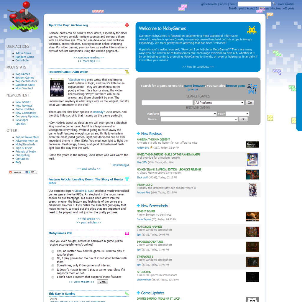
http://i421.photobucket.com/albums/pp292/SharkD2161/Webproj/mobygames_sitedesign_mockup_k.png
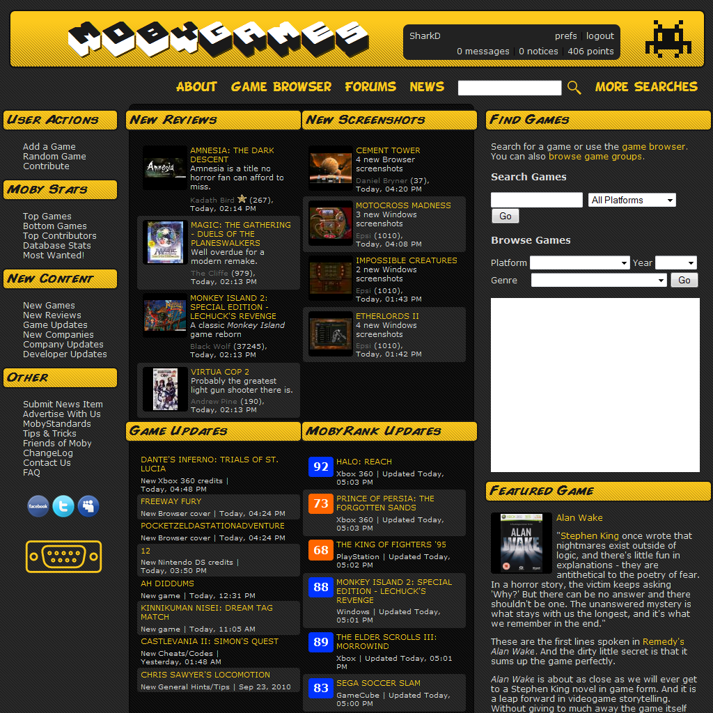
Indra was here (20755) on 9/29/2013 2:22 PM · Permalink · Report
[Q --start SharkD wrote--]I came up with some designs of my own but nobody liked them. sniff
:(
http://i421.photobucket.com/albums/pp292/SharkD2161/Webproj/mobygames_sitedesign_mockup_f.png
http://i421.photobucket.com/albums/pp292/SharkD2161/Webproj/mobygames_sitedesign_mockup_k.png [/Q --end SharkD wrote--] Hey, didn't I see these before on another gaming website?
Well, if it makes you feel any better, your designs are by far superior than this current redesign. As your two examples have shown, there are priorities in the layout to interest users. I prefer you second example, only because it's dark. Though I can't say I'm wild about the header fonts. White backgrounds are notoriously difficult to master, without making a page look unappealing.
Fred VT (25953) on 9/29/2013 4:30 PM · Permalink · Report
[Q --start SharkD wrote--]I came up with some designs of my own but nobody liked them. sniff
:(
http://i421.photobucket.com/albums/pp292/SharkD2161/Webproj/mobygames_sitedesign_mockup_f.png
http://i421.photobucket.com/albums/pp292/SharkD2161/Webproj/mobygames_sitedesign_mockup_k.png [/Q --end SharkD wrote--]
You bull's eyed the priority information and functions, please link those to the FB MobyGames page, might help them get what we want (if they actually give a ****).
I find that the themes generally look good, but a bit kiddish for a database such as this (on the contrary, the new one looks so serious that it looks tired...). But I'd used these as base for a new design anytime over this one, they could definitely be worked-out to be what everyone wants!
piltdown_man (236385) on 9/29/2013 3:07 PM · Permalink · Report
Hi fester
Good to hear from you. You pretty much nailed it in this post. Like you I set myself targets and goals to achieve and I too thought I was building something that would last. The community meant that there was always someone who would help me out when I had a problem with a submission. Even if Gamefly hires someone capable of patching this dross so that it's functional I'm not sure how many contributors / reviewers will want to carry on.
It's all very sad and disappointing.
Indra was here (20755) on 9/29/2013 3:14 PM · Permalink · Report
[Q --start piltdown_man wrote--] It's all very sad and disappointing. [/Q --end piltdown_man wrote--] piltdown man has unlocked achievement: the Last Contributor, as of Sept. 21, 2013.
Oh, nice logo, mate.
piltdown_man (236385) on 9/29/2013 3:57 PM · Permalink · Report
The saddest thing is I put some more contributions up today. I'll miss Moby and I don't know of another site that's as good as Moby was.
Rola (8483) on 9/29/2013 4:45 PM · edited · Permalink · Report
^^ yes, I guess we switch to this image. It's too late for going back (as if we could hope for them to yeld to our demands anyway...).
It also sends the correct message. It's not just about poorly done layout. It's about lousy management of the new MG owners.
Ƒreddƴ (5833) on 9/29/2013 5:17 PM · Permalink · Report
[Q --start Rola wrote--]^^ yes, I guess we switch to this image. It's too late for going back (as if we could hope for them to yeld to our demands anyway...). [/Q --end Rola wrote--]
It lacks that new mobygames experience so fixed it for you ---->
Indra was here (20755) on 9/29/2013 6:40 PM · Permalink · Report
[Q --start abandoned moby b4 it was cool wrote--] [Q2 --start Rola wrote--]^^ yes, I guess we switch to this image. It's too late for going back (as if we could hope for them to yeld to our demands anyway...). [/Q2 --end Rola wrote--]
It lacks that new mobygames experience so fixed it for you ----> [/Q --end abandoned moby b4 it was cool wrote--] Yup. Yours is the best thus far. At this rate, we'd end up having better avatars than the website has bug fixes. :p
Fred VT (25953) on 9/29/2013 6:58 PM · Permalink · Report
[Q --start Indra is watching it all burn... wrote--] [Q2 --start abandoned moby b4 it was cool wrote--] [Q3 --start Rola wrote--]^^ yes, I guess we switch to this image. It's too late for going back (as if we could hope for them to yeld to our demands anyway...). [/Q3 --end Rola wrote--]
It lacks that new mobygames experience so fixed it for you ----> [/Q2 --end abandoned moby b4 it was cool wrote--] Yup. Yours is the best thus far. At this rate, we'd end up having better avatars than the website has bug fixes. :p [/Q --end Indra is watching it all burn... wrote--]
I have to agree this is the best one so far, although it could be even better...
Donatello (466) on 9/30/2013 8:46 PM · Permalink · Report
[Q --start Cavalary wrote--]10 refreshes, so 30 possibilities, and I saw 4 protest avatars, one protest nick with no avatar and this, um, independent protester? [/Q --end Cavalary wrote--]
A lot of the top contributors have jumped ship a long long time ago.
PCGamer77 (3158) on 10/1/2013 4:52 PM · Permalink · Report
The only good thing I can say for the redesign is that it looks pretty decent on my iPhone. Otherwise, it's a disaster. Blinded by the white...
I don't see how this ends well. Given the choice between throwing good money after bad and straightening this mess out, or just shutting down MobyGames, which sounds easier if you work at Gamefly?
"Actually, it turns out that most of our customers don't give a rat's ass about older games, which is what MobyGames is really about." Terminate website? Vote unanimous. Meeting adjourned.
Genki (1855) on 10/3/2013 5:15 AM · Permalink · Report
The new design looks absolutely terrible and awful. Like made for equally awful smartphones. I don't have a smartphone, I use Mobygames on my Desktop PC. The redesign is an insult to all Desktop PC users.
I won't contribute anything anymore until I can use my wonderful "MobyDark" Theme again! You lost a regular contributor due to its design (reminds me of the terrible Flickr redesign too). So there!
Also, my inbox shows the outbox content! I can't write to my inbox contacts anymore. What sorcery is that!?!?!?
Please give us back the old design!
Starbuck the Third (22606) on 10/3/2013 2:47 PM · edited · Permalink · Report
[Q --start Genki wrote--]The new design looks absolutely terrible and awful. Like made for equally awful smartphones. I don't have a smartphone, I use Mobygames on my Desktop PC. The redesign is an insult to all Desktop PC users. [/Q --end Genki wrote--]
I personally use a 10-inch Android tablet for 99% of my internet usage, and that has absolutely no problem with just about every last internet site I use esp. the old MG layout/design, so l find this whole "redesign was for tablets" justification an insult. Even with smartphones, the problems not with the website, its what your accessing it from that's the problem, not the site.
Rockin' Kat (2655) on 10/7/2013 8:49 AM · edited · Permalink · Report
It's a shame the new design can't handle being viewed in nearly as narrow a browser window without left-right scrolling as the old design could... made it handy when doing submissions to be able to not hide other windows such as folder listings and scans open in the background while searching or filling in submission forms. I make use of drag and drop a lot to get box scans uploaded, but when the window is so wide it constantly winds up obscuring the other windows I'm working with and slows things down.
I think the new logo looks OK.
I wish my point count on the top of the page was still a clickable link that went to submission status information.
Having the available actions at the bottom of each thread post in a top to bottom list seems like an odd use of space and they don't really pop out saying "I'm here to get used!" as much as I think they could... but I dunno... I guess this flat and undefined thing is a current trend... it feels kind of unfinished to me.
chirinea (47495) on 10/7/2013 12:41 PM · Permalink · Report
[Q --start Rockin' Kat wrote--]Having the available actions at the bottom of each thread post in a top to bottom list seems like an odd use of space and they don't really pop out saying "I'm here to get used!" as much as I think they could... but I dunno... I guess this flat and undefined thing is a current trend... it feels kind of unfinished to me. [/Q --end Rockin' Kat wrote--]This is clearly a bug, not a feature. Just see how the Preview and Send (no preview) buttons appear normally when you're replying a post.
Havoc Crow (29859) on 10/23/2013 12:04 PM · Permalink · Report
It would be nice if, when approving new games or platforms, we could see the full-sized cover with a single click from the approval page itself, instead of having to click on the "edit cover group 1" link.
Also, when approving a new platform, captions of the newly submitted screenshots don't show up and you cannot click the screenshots.
Mobygamesisreanimated (11069) on 10/26/2013 11:03 AM · Permalink · Report
I just wanted to say thank you to the new owners and coder(s?) in particular. Your hard work is really starting to pay off! I know there were bugs and some people had their doubts, but the site is coming along nicely. There are barely any bugs left and the design is improving constantly. At this rate, within a few months, we might even get screenshot pages that don't need minutes to load and rap sheets that don't look like utter shit. I suggest you all take a well-earned moment of rest and pad yourself on the back. And again, thank you!
John Dough on 10/28/2013 4:58 PM · Permalink · Report
redesigned site is very slow to load, especially images...